Data Collection / UX and Interface Design and Digital Prototype
Project Overview
Challenge: In my Interactive Web Design course taught by Zach Kaiser, I was issued a unique assignment. Create a collection of 100 things, record metadata about each, and design an interface for navigating the collection. The more unusual or interesting the content the better, so I chose to work with my railfan dad's vast train slide collection.
Team: One UX designer, but shoutout to my dad for scanning and sending me 100 different slides and answering my metadata questions.
My Role: Data organization, sketching, image editing, user experience design, user interface design, visual design, interaction design, digital prototyping
Technologies Used: Google Sheets, Adobe Photoshop, Sketch, Flinto
After I completed the data and metadata collection and organized my information, I began framing my ideas with sketches and low-fidelity planning. Once I had a good idea of where I was headed, I moved into the high-fidelity design stage and created more involved mockups of my screens. I combined these screens and showcased the interactions with an interactive prototype.
This process is broken down in detail below, or you can jump to the deliverables to view the final products.
My Process
Data and Metadata Collection
After settling on the collection I would be working with, I spoke to my dad about the information I would need. He agreed to go through his slide files and select 100 to send scans of to me, along with metadata about each. I also asked him to send me images of the physical slides; each one had tiny writing and other markings on the frame that I thought might prove useful in my designs.
While I organized the information my dad sent to me into a spreadsheet, he did the hard work here of scanning each slide (twice!) and sending me all of the information.
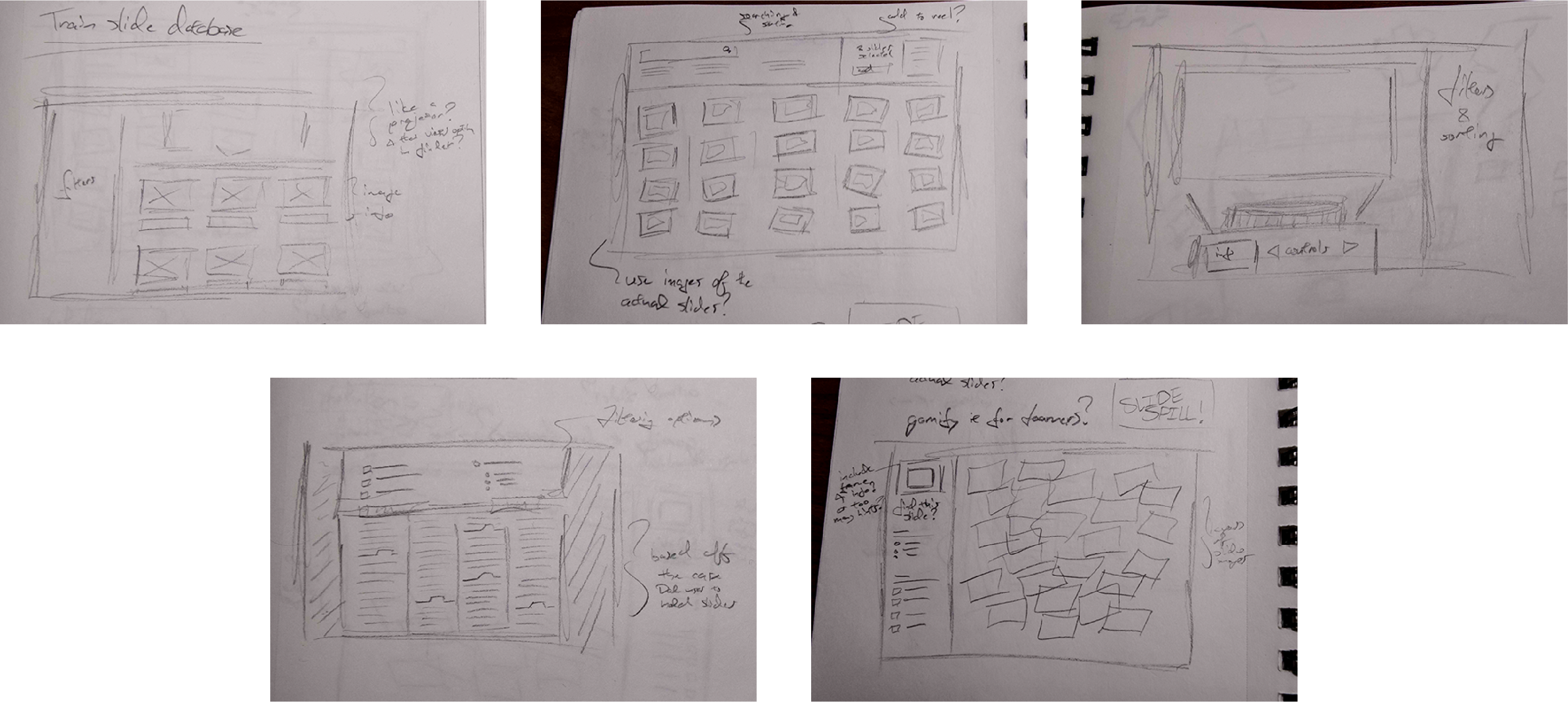
Once I knew what my data looked like and had a set of resources to design from, I decided to put some ideas on paper. I sketched a handful of different user interfaces to push myself to create interesting and diverse directions I could take the project in.
Sketches of several different possible interfaces.
I started by not straying too far from the straightforward, e-commerce style wireframe. The images in a grid was a little basic, so I thought about incorporating the images of the physical slides. Then I recalled the look of an old slide projecter, and once I started on that road I rolled with it. I created one design inspired by a slide file, one where the entire interface would focus on a projection, and one with slides scattered over the floor and a gamified "Find This Slide" panel asking users to filter the pile for what they were looking for.
During an in-class peer review of our wireframes, I asked classmates which route they thought might be the most interesting. The gamified slide pile easily generated the most enthusiasm, so I decided to focus on that idea.
High-Fidelity Design
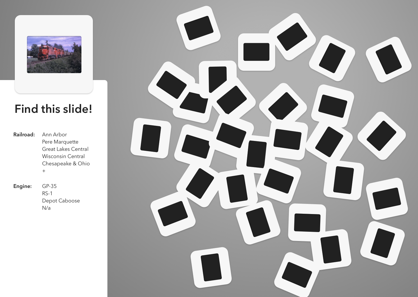
I began building my mockup for the interface in Sketch. I created a simple vector version of a slide and scattered several versions of the symbol across the screen. I used a subtle grey gradient for the background, hoping to illustrate what a concrete floor might look like without being too realistic; I didn't want to lose the simplicity and cleaniness of the UI.
My first draft of the slides database UI.
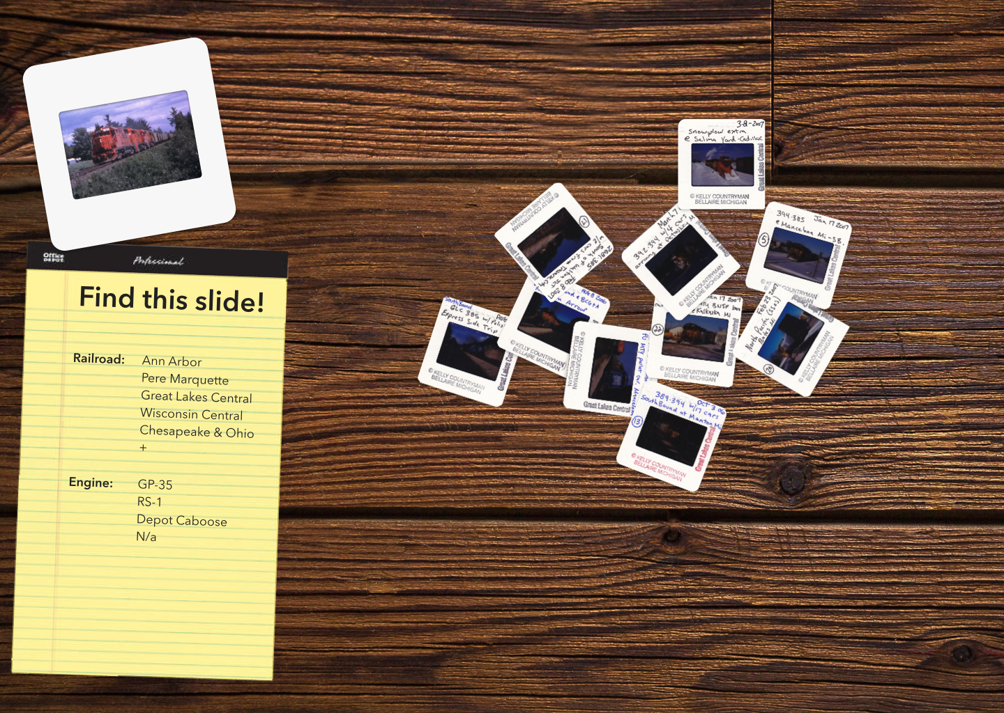
Then my professor told the class we'd need to create two different visual design directions to show for our next critique. I thought about jumping back into one of my other intial sketches, but when I looked at them, I remembered a different idea.
I had all of those images of the physical slides at my disposal. Why not make my second visual design direction an outrageous break from today's UI trends? After all, it was a class project, and that gave me the liberty to experiment.
My second visual design idea went as far in the opposite direction as possible.
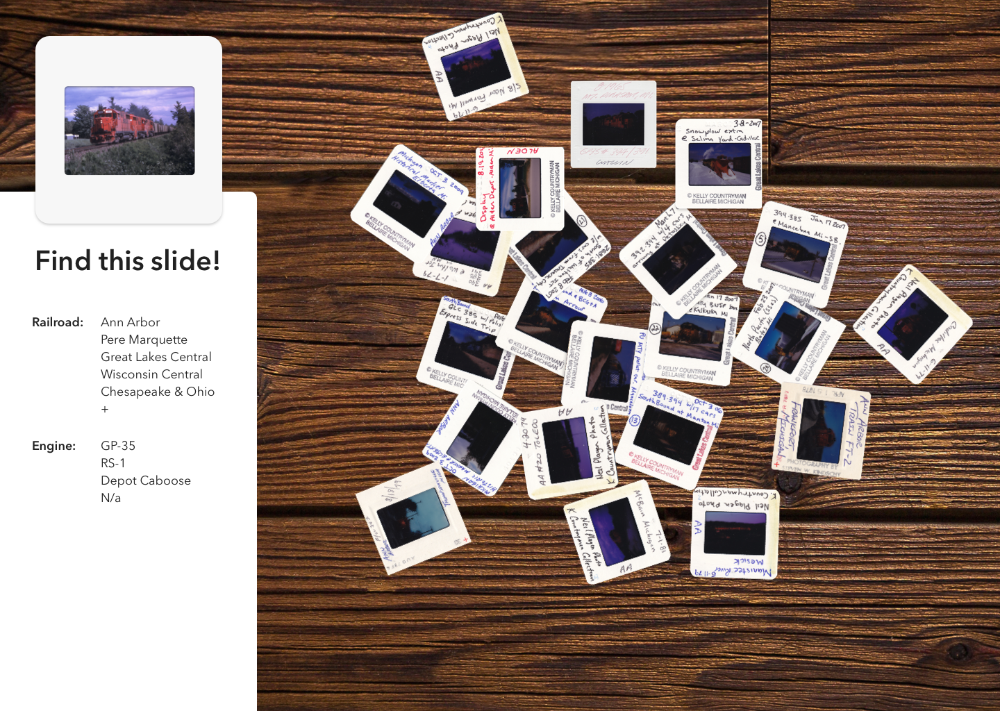
I showed each of these directions to my professor and classmates for critique. Surprisingly, most of the positive feedback I received was for the more skeumorphic interface. The legal pad replacing the filter panel won no points, and most people were opposed to its tilt and that of the target slide. I decided to do my best to compromise between the two directions and create something that didn't sacrifice usability in pursuit of personality.
Finding the best direction.
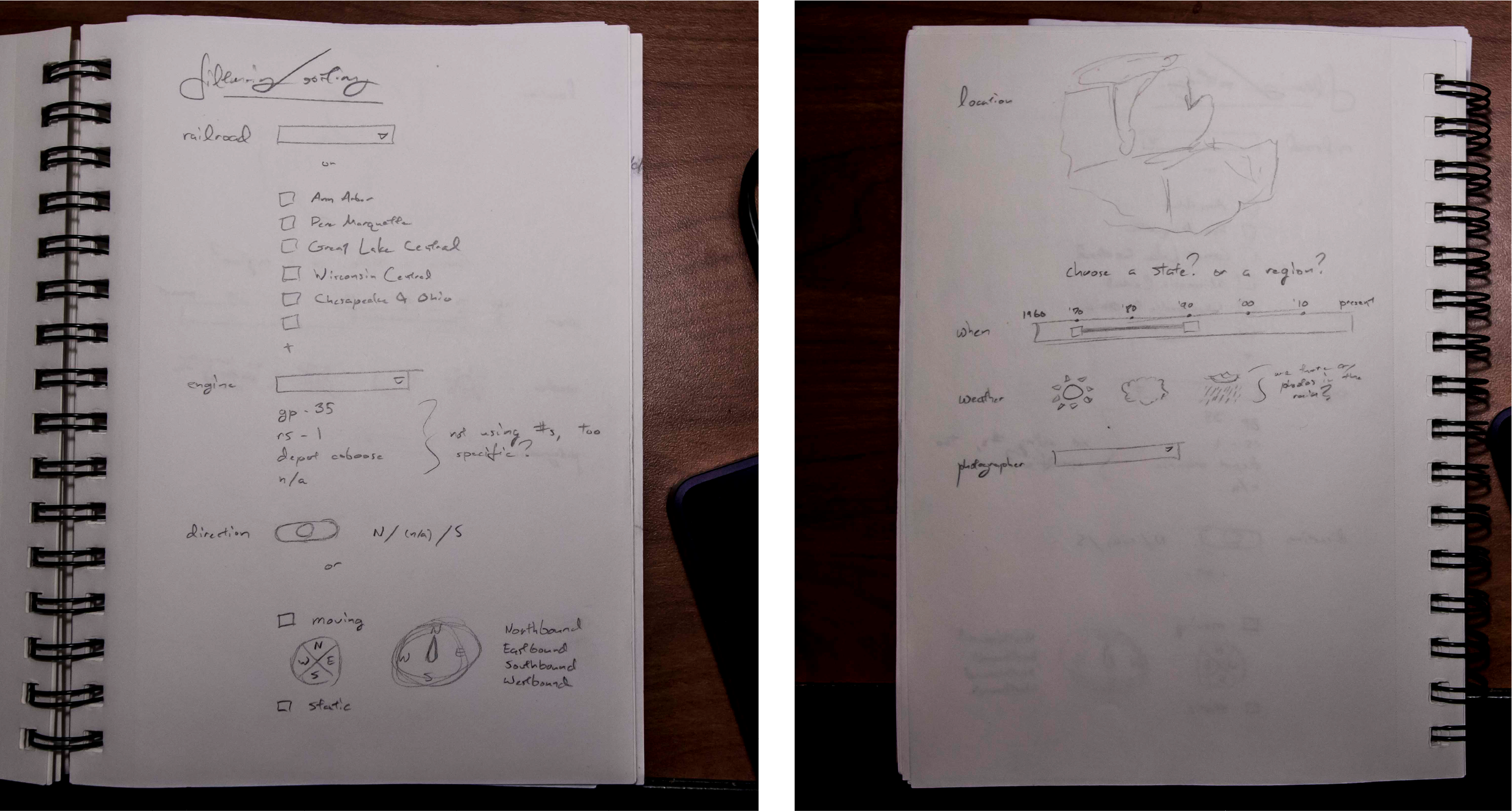
Finally I was happy with my visual design direction. My new problem, I realized, would be the interaction. The filtering menu was lacking in options and looked plain next to the rest of the interface. I flipped back open my sketchbook to plan out the filters.
Figuring out how to filter the database.
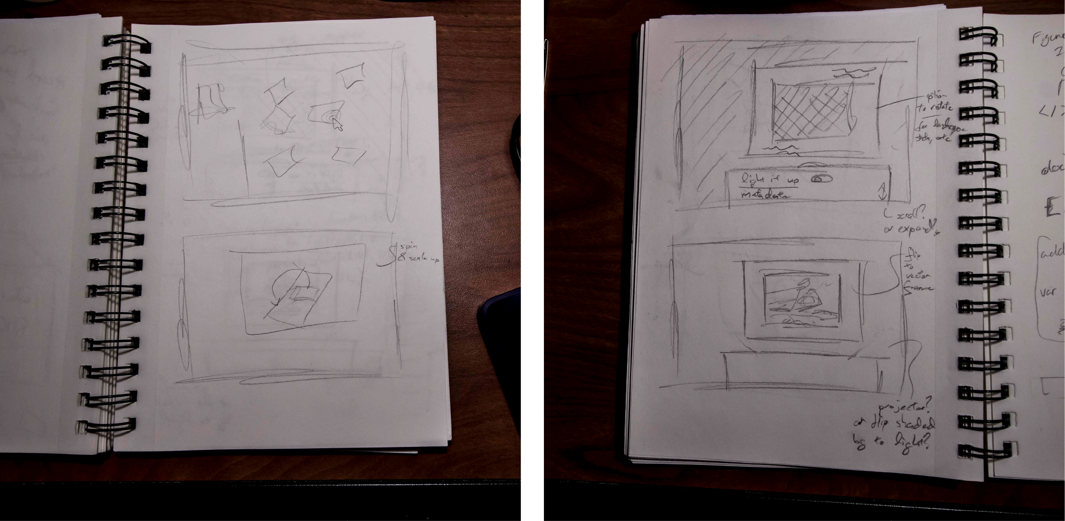
Sometimes, as I worked through my static designs, I would be struck with ideas for interactions. For example, when I was starting to think about a detailed view so users could learn more about each slide and possibly confirm that they'd found the one they were searching for, I had inspiration for how to transition to that screen and what interactions should exist in it. There wasn't a way for me to quickly make these ideas reality while working in Sketch, so I again returned to my sketchbook and quickly scrawled out the ideas so I could open back up to them once I began crafting a prototype.
Transition from the main scatter screen to a detailed view of the slides and interaction ideas for that screen.
Interactive Prototype
When I was finally far enough along to move into creating my prototype, I faced a dilemma. The interactions I'd planned for couldn't be created with Sketch's prototyping feature, or with InVision or Adobe XD. Axure would be able to do it, but not without a lot of effort. I decided to dig around for a prototyping tool that was capable of producing complex animations and interactions without a time commitment close to developing the designs with code.
I landed on Flinto. While the criticisms I read of it were that it couldn't export code and therefore wasn't as useful for projects headed to development, I found one more reason this fictional project was useful. I didn't have to worry about how it would be built; it wouldn't be.
A demo of the final Slide Spill interface.
Handing the Design Off
The last thing to do with my finalized design was to prepare the materials for it to be handed off to a developer. I had kept all of the metadata about the slides and the images of them well organized, but I needed to put together a document that explained the interactions I had designed.
Try out multiple versions of everything, and get feedback on them all. I might have gone the safe route with the visual design if not for everyone I spoke to loving the aesthetic of the real slides.
Get out of your comfort zone with software. This project had me trimming the background off slide photos with Photoshop, designing an interface with Sketch, and making it move with Flinto. My experience with those programs was all different, but knowing what I wanted to do was possible meant I just needed to jump in and figure it out.
Get in Touch
Email me! Connect with me on LinkedIn!