UX, Interaction and Visual Design / Marketing Material Design
Project Overview
Challenge: In the fall of 2016, WIDE Research acquired Sherlockian.net, a massive website full of information and links to all things Sherlock Holmes, and set sights on updating and redesigning the site. I joined the team as they were in the midst of hashing out a new information architecture and learning to work with the Wordpress theme they had selected.
Team: While the main original team consisted of the WIDE Research director (Liza Potts), a web developer (Kalib Watson), an information architect, a content writer/editor, and myself, that team shifted as some members graduated and as others joined the project.
My Role: Interaction design, visual design, front end development, homepage content design, content strategy, branding, marketing material design
I joined the team to focus on visual and interaction design, so I immediately jumped in and crafted a visual identity and interface for the new site. After establishing the sitewide visuals and launching the redesign, we looked closer at areas where users were having difficulty engaging with the content. This led me to propose redesigns of the homepage content and the search results page. While working on these user-facing aspects of the website, I also designed business cards, stickers, a lapel pin and other marketing materials for the site.
My Process
Website Interface
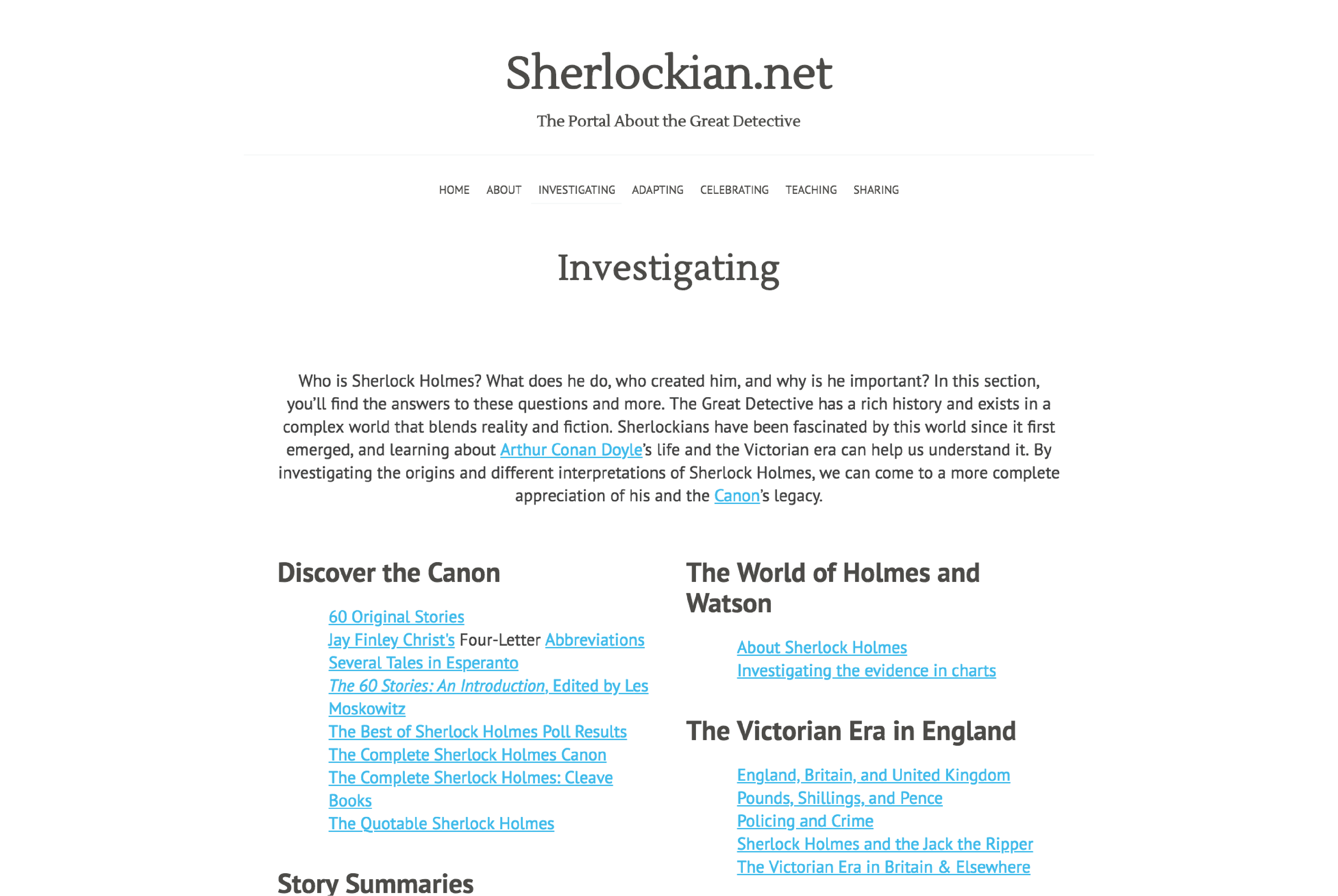
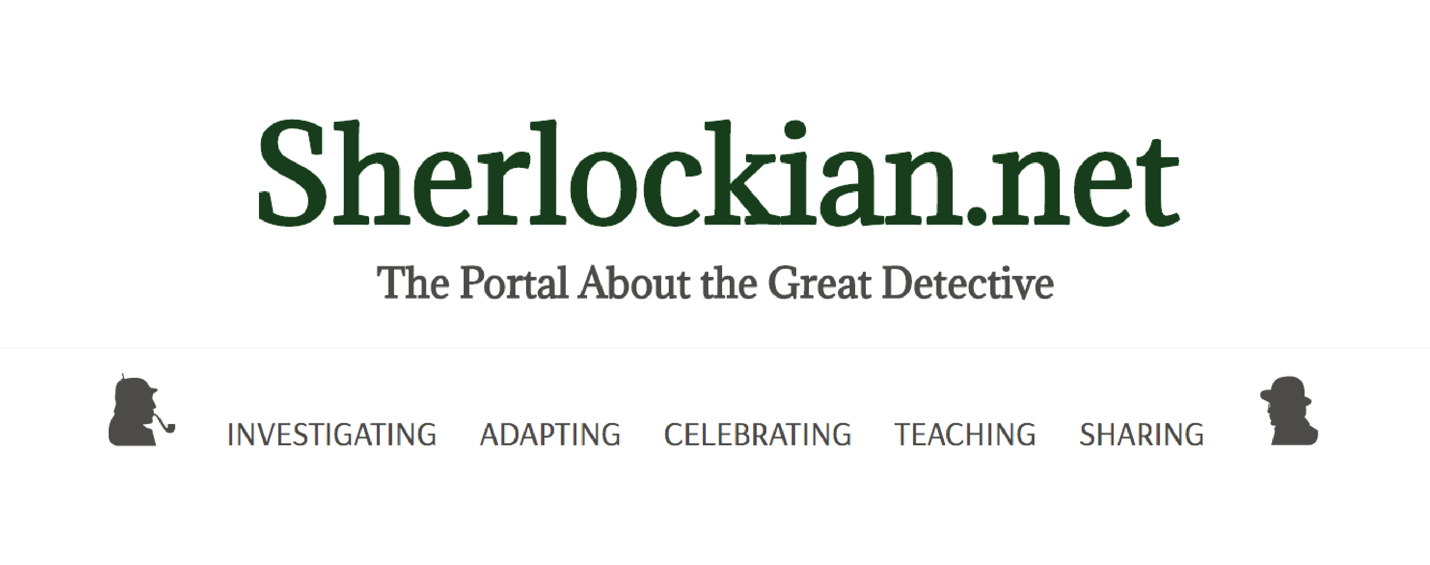
I joined the Sherlockian.net team just after their selection of a Wordpress theme, which meant I knew the general direction they wanted me to take in crafting how the website would look, feel and behave. The theme the team chose was incredibly simple: centered title with a tagline right below, keyline preceding the navigation, columns for the lists of links the portal site was known for.
The Sherlockian.net redesign's initial interface for the section landing pages, straight out of the Wordpress theme box.
While the interface achieved the goal of a clean, simple design, it stripped away all of Sherlockian.net's personality. The original site, built in the 90's with a rudimentary HTML table-based layout, wasn't pretty or very usable, but it had a feel Sherlockians had grown to love. The goal of restructuring and redesigning the site was to make it easier for users to navigate and peruse, but I knew the community wouldn't enjoy interacting with something that didn't feel like a progression of the well-known site.
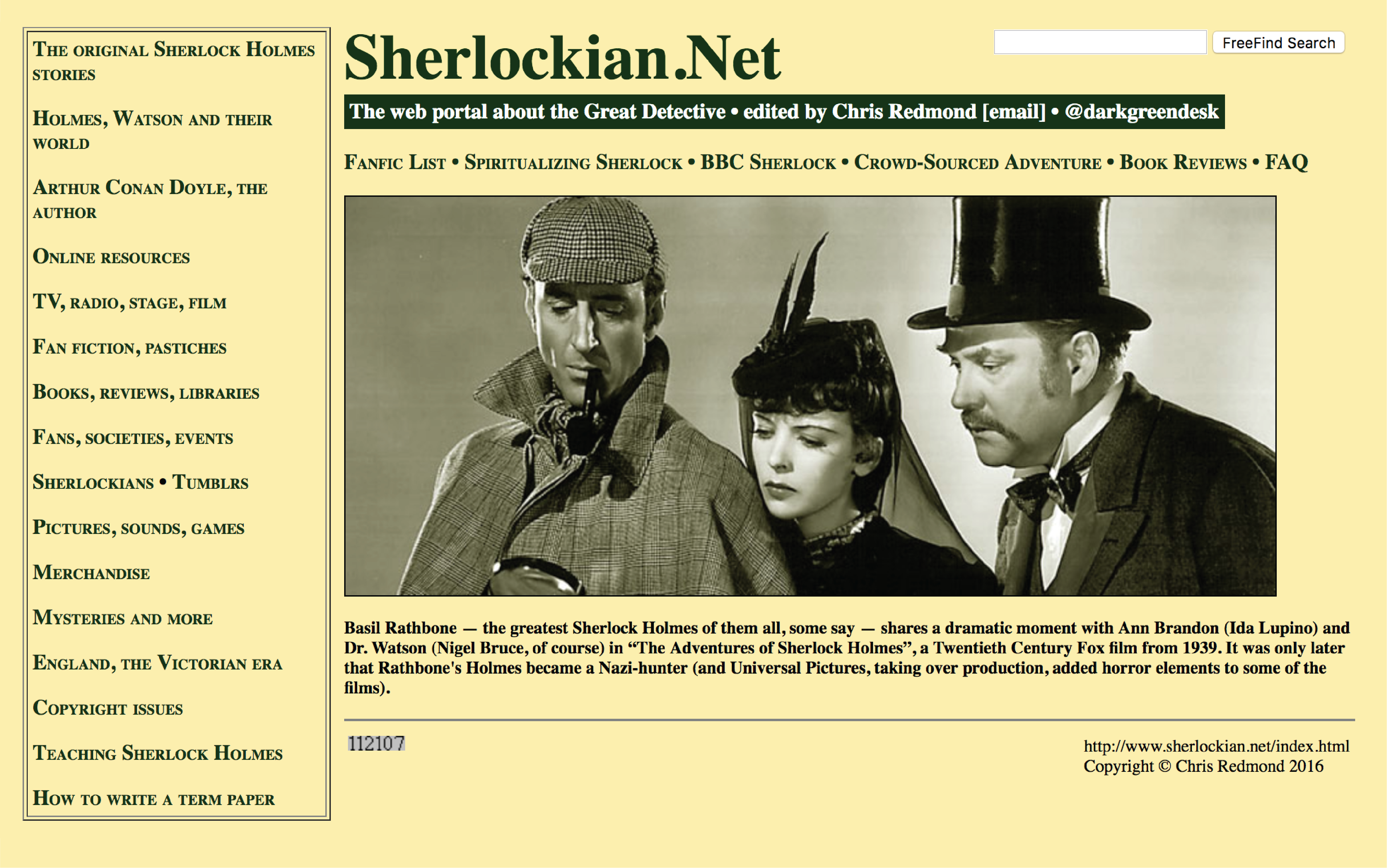
The homepage of Sherlockian.net, in all its Times New Roman glory, just before WIDE Research acquired the site.
Despite the easy criticisms one can make about the original Sherlockian.net design, it was important to give credit where credit was due. The pale yellow of the background and familiar serif typeface easily makes one recall curling up to read an old book set in a era that's long gone now.
I didn't want to lose the rhetorical effect of Sherlockian.net to an overly modern and digital interface, so I set to work crafting a graphic identity that would seamlessly blend the old and the new.
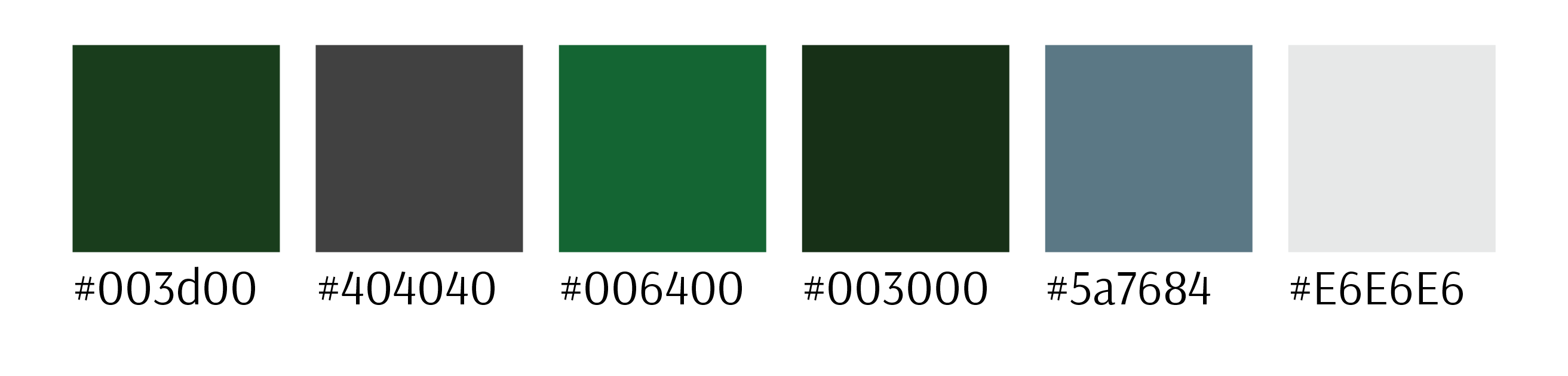
Colors for the Sherlockian.net redesign.
I pulled the dark green from the original Sherlockian.net site and tweaked it to better suit our white background. I also chose a subtle grey with good contrast to use for the majority of text on the site.
With my main two colors in hand, I decided on a couple shade and tints to be used for things like link text and keylines. I then moved on to choosing fonts and incorporating these colors into Sherlockian.net's typographic style.
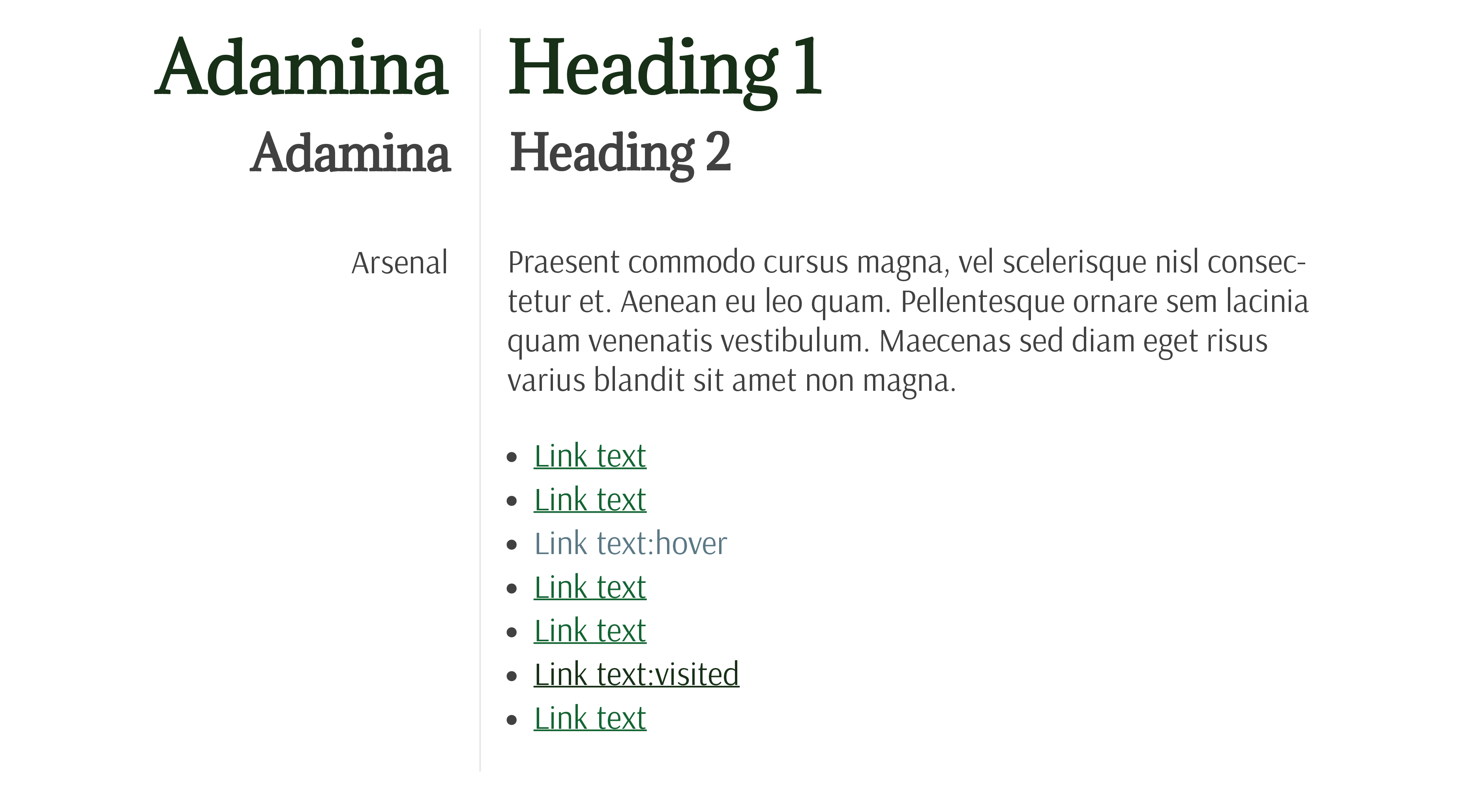
The type style for each level of a major Sherlockian.net page.
I settled on Adamina, a tall and readable serif font for the page headings. Because much of our audience is older and the main subject matter is a set of stories from the late nineteenth and early twentieth century, I felt it was appropriate to use a typeface like Adamina rather than something more modern and sans-serif.
For the same reasons, I chose Arsenal as a body font. While it is a sans-serif, and therefore generally better for body copy on the screen, it doesn't feel like one. Like Adamina, it has a high x-height, which lended to them pairing well together.
The blocks with headings and unordered lists that are characteristic of the Sherlockian.net site.
These decisions tied together well for the landing pages of Sherlockian.net's main content sections. My focus on the readability of the content drove my careful consideration of how far apart to space list items, whether or not to add bullet points, and how we should divide each list block.
One of the most exciting parts of this project was the opportunity to use design software to mock up ideas, then implement them on the website by writing my own CSS. I made each change to the Wordpress using Additional CSS in the Customizer, which allowed me to see live how each shift affected the design and made it easy for me to take several quick screenshots of different versions and drop them into our Slack channel for feedback.
The site was making progress. It was beginning to have its own identity, but something was still missing. We bantered back-and-forth during a team meeting about the crazy things we might want to try, and I popped up with an idea that wound up becoming one of the key pieces of Sherlockian.net's brand.
The Sherlock Holmes and Dr. Watson icons from The Noun Project that became the focal point of our brand.
On the original Sherlockian.net site, the main page was titled "Holmepage." While we joked about carrying forward this relic, the team decided it didn't fit the identity we were cultivating. During one of these conversations, I suggested using icons of Holmes and Watson for the home and about pages in the navigation. The WIDE director pounced.
"Yes! We're doing that."
So I weeded through Sherlock Holmes and Dr. Watson icons on The Noun Project and landed on a set that fit the bill. We purchased the SVGs and I reworked the navigation to include them, facing towards each other on either side of the content section links.
The crown jewel in Sherlockian.net's visual identity: the navigation with Holmes and Watson watching over it.
I worried at first that users might not realize they were buttons and fail to click on them. This was remedied when the WIDE director took this initial version of the site to 221B Con and tested it with potential users. She found that participants immediately were intrigued by the icons and wanted to click on them. Just to be safe, though, I did ensure that the hover and active states on the regular navigation links also functioned properly on the icons.
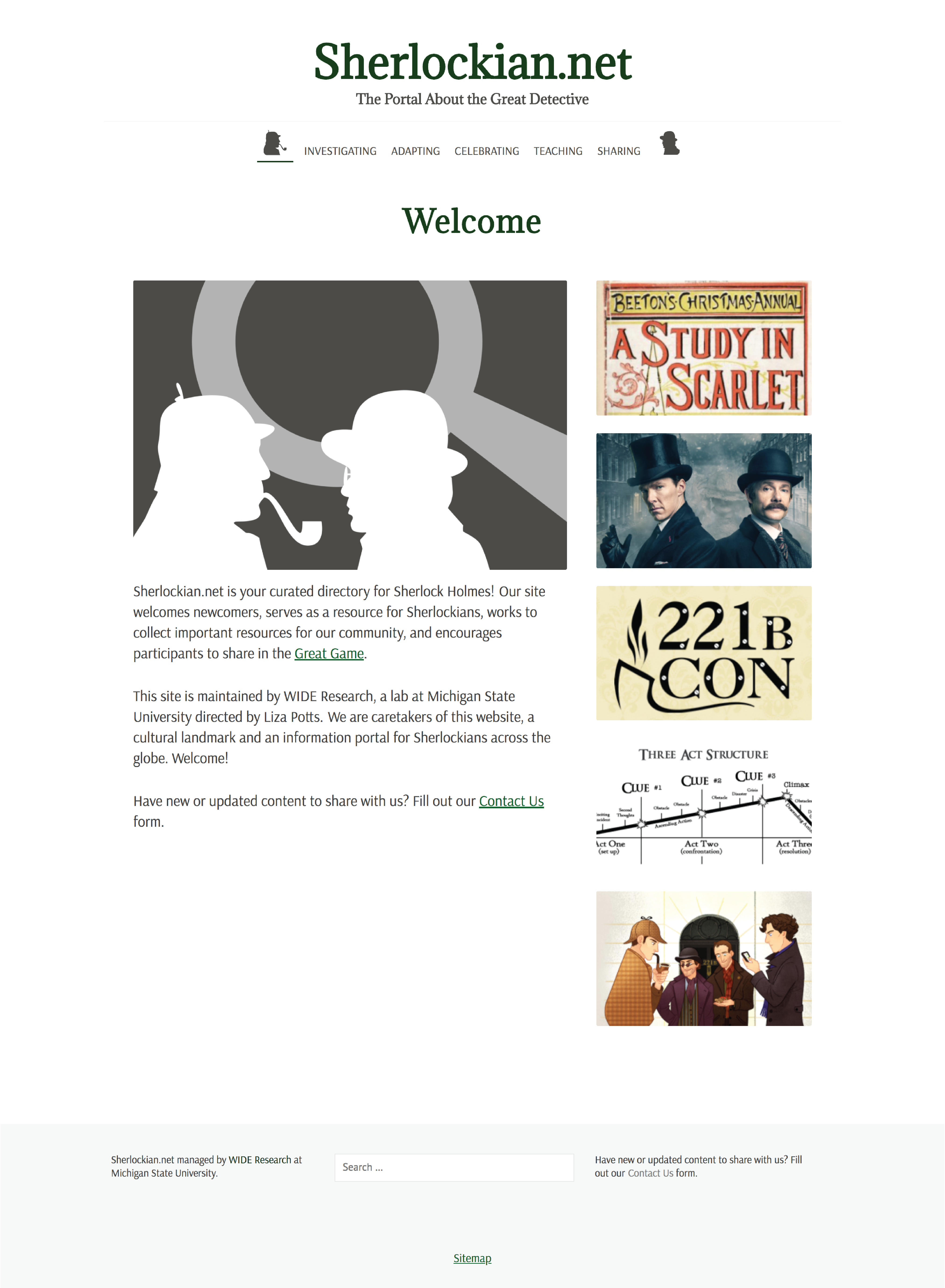
Finally, after months of preparation, we launched the redesigned Sherlockian.net. Now came the opportunity to hear from users and iterate on our live design.
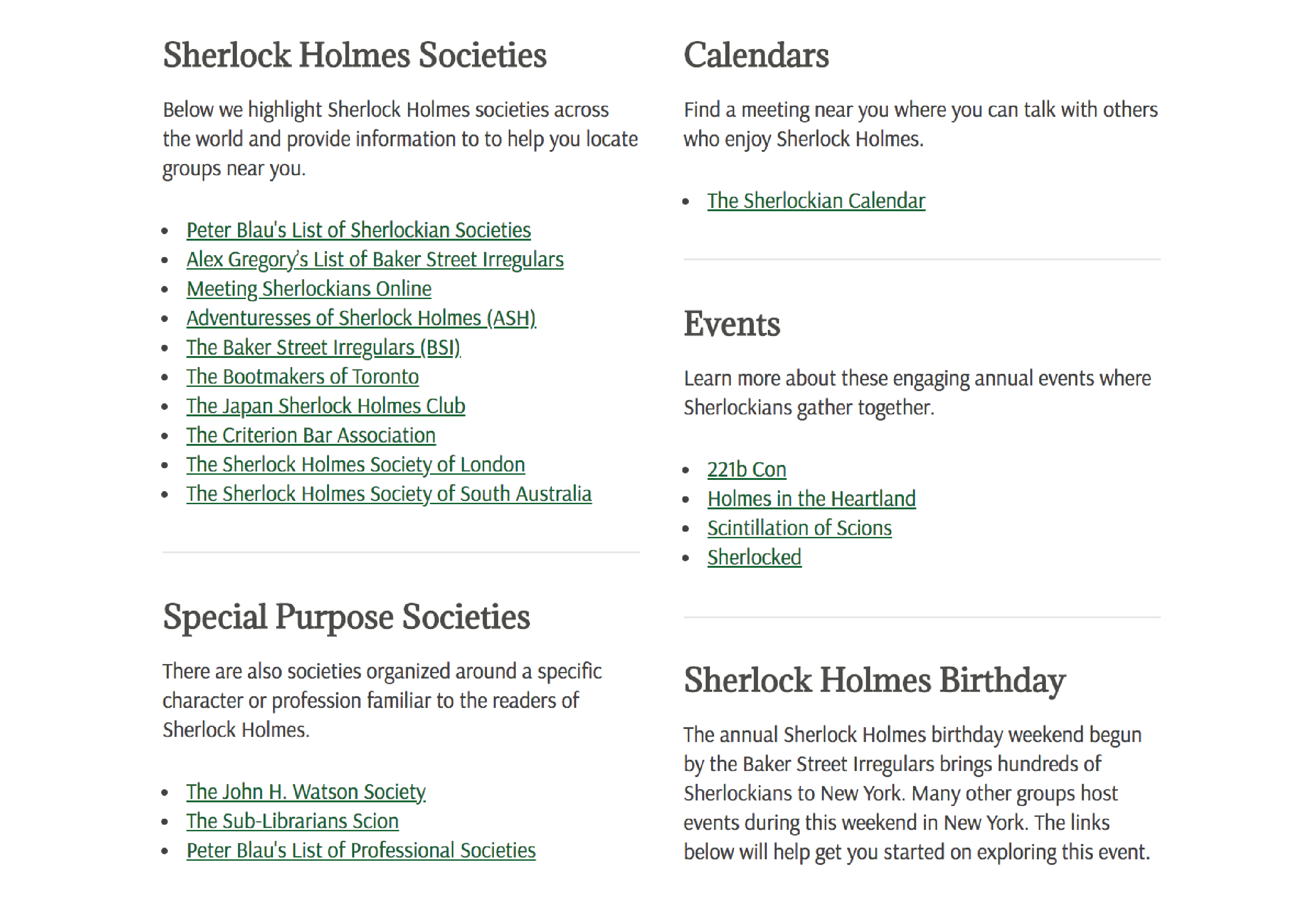
Homepage Design and Content Strategy
The homepage of Sherlockian.net was a challenge. The director's initial intention was to let it function as a second, more visual form of the main navigation. We sought out images to represent each of the five pages and put them together in a basic layout. I also added a section for main content, and for the initial launch we used the graphic elements for the marketing materials as a primary image and included body text welcoming users to the new site and informing them of the change.
The new Sherlockian.net homepage at first launch.
It was not enough. Not only did the first version of the homepage contain little to catch users' eyes, it was also unclear that the sidebar of images were links to the landing pages for each section. We received feedback that users, particularly the older demographic who had grown used to navigating the original site, were frustrated with the new information architecture and confused about where to locate their favorite resources.
We decided to tackle this issue from a number of different directions, but the most crucial one was the homepage. Because it is the first thing users often see when they visit the site, we needed it to provide any information necessary for users to find their way around.
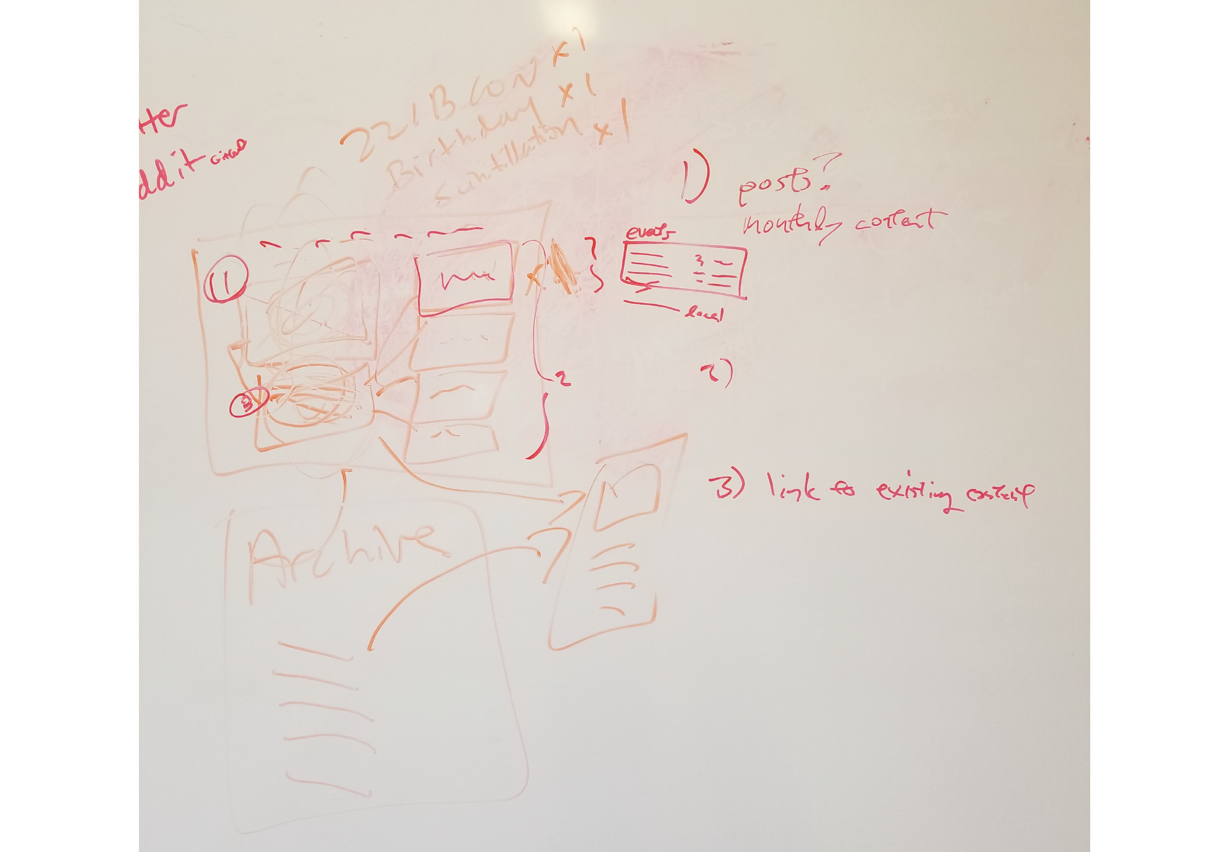
Whiteboard collaboration: Liza in orange, me in red.
The WIDE director illustrated her vision on the whiteboard during one of our team meetings. She suggested taking the basic version we currently had and adding more interactions to clarify for users what the sidebar image links were and where they would take them.
I jumped in to propose a more thorough redesign of the page. While keeping the idea of a main content section with monthly campaign content, I wanted to create more points of entry for the site and to empower users to find new things. I also wanted to offer them information they could use right from the get go.
I suggested a couple of different types of modules that could be used on the page, as well as thoughts about how we should go about structuring the content in Wordpress. Because the Sherlockian community is broad and has a number of high-profile events over the course of the year, I suggested offering a countdown box right at the top of the site. I also wanted to move the search bar up into the homepage, so it would be easier to find and utilize from the get-go.
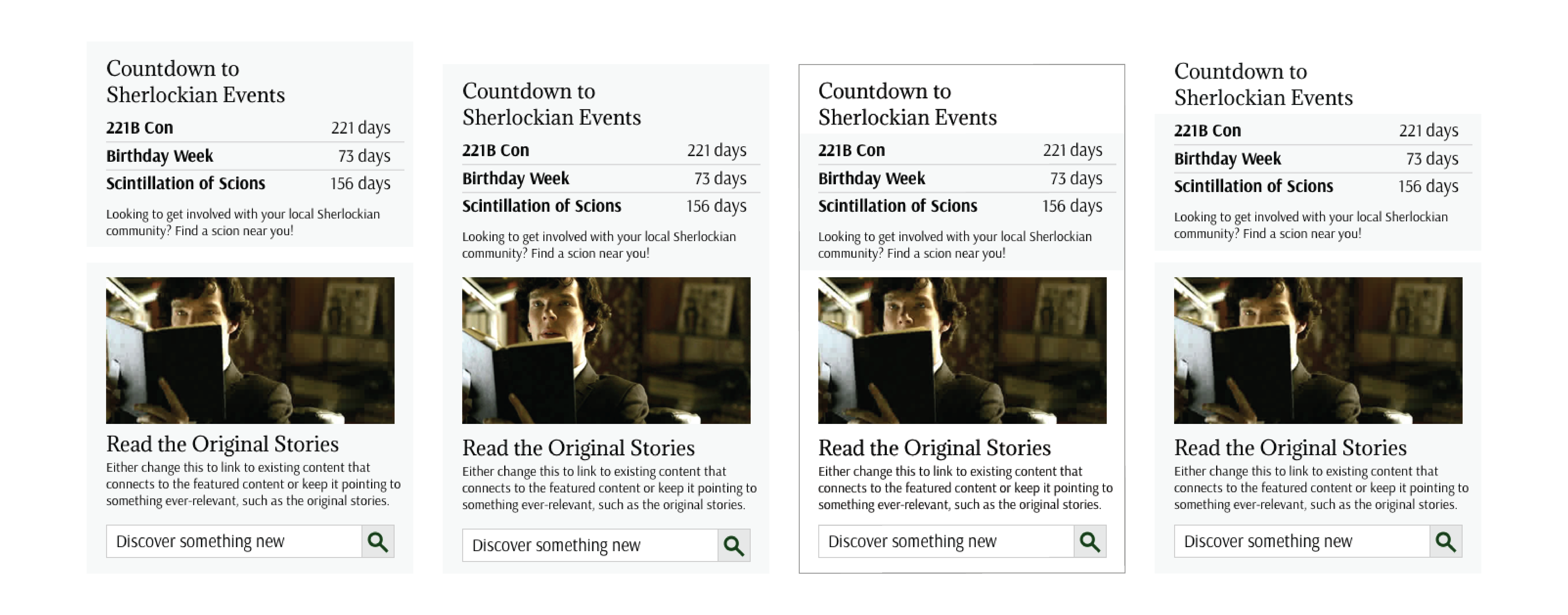
Slightly different visual designs for a homepage sidebar module featuring an event countdown, a link to content and the search bar.
When I sent my first draft of this module to the team in Slack, it received good feedback for the content. I quickly mocked up each of the visual design changes my team wanted to see and together we chose a direction.
I also wanted to add some links below to visually balance out the page and offer more options for users just perusing for interesting content.
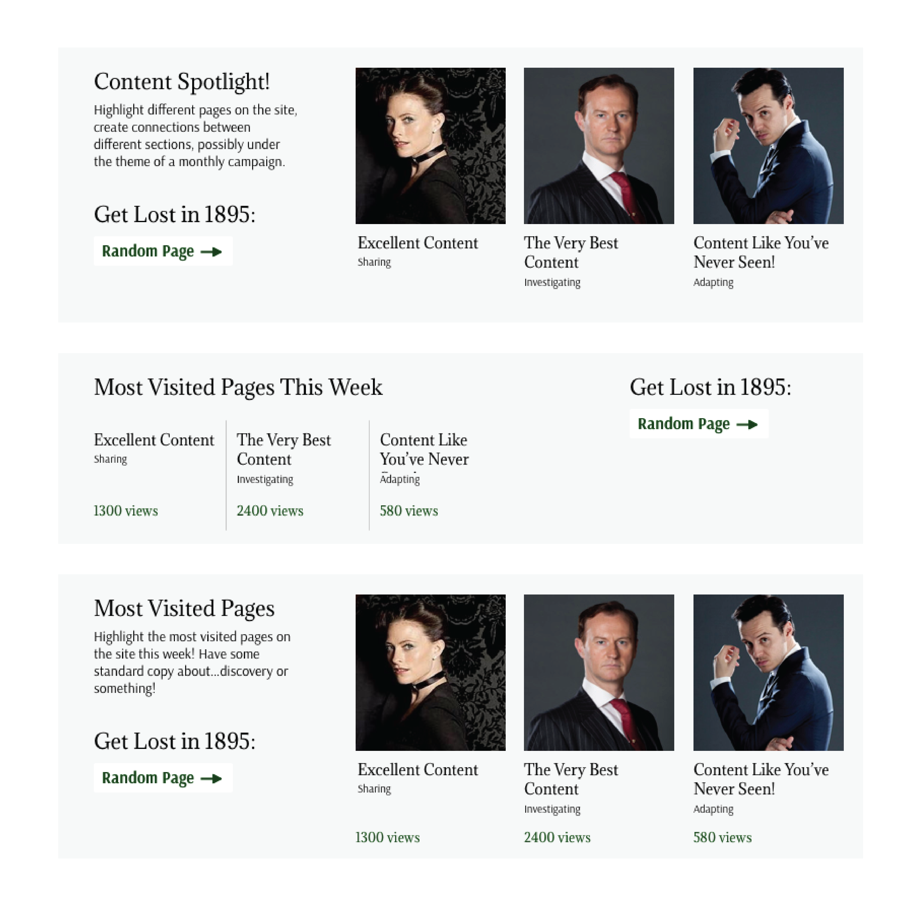
Different ideas for what should be included and how we should design the bottom homepage content module.
At first, I treated this module as a way to round out our idea for a monthly campaign by offering content creators and curators a place to link to more related content. I discussed this with the content team, however, and learned that they weren't planning to treat the campaigns in that way and weren't certain there would always be three specific places they wanted to link to.
One content editor suggested that instead of this, we turn it into a "most visited pages" module. This could be automated and require less manual upkeep on behalf of the team. When I first mocked up this version, I dropped the images that I had used in the first iteration and quickly heard dissenting opinions. The visuals were crucial for balancing out the page and drawing users' eyes to the module.
I also added a bit of mystery into this content module by designing a button to take users to a random page on the site. There are currently over 350 different pages and posts the button could send users to, and many of those are littered with links to places all around the online Sherlockian community. I titled it "Get Lost in 1895" to reflect the act of jumping down an online wormhole and also to reference the Sherlockian mantra, "It is always 1895!"
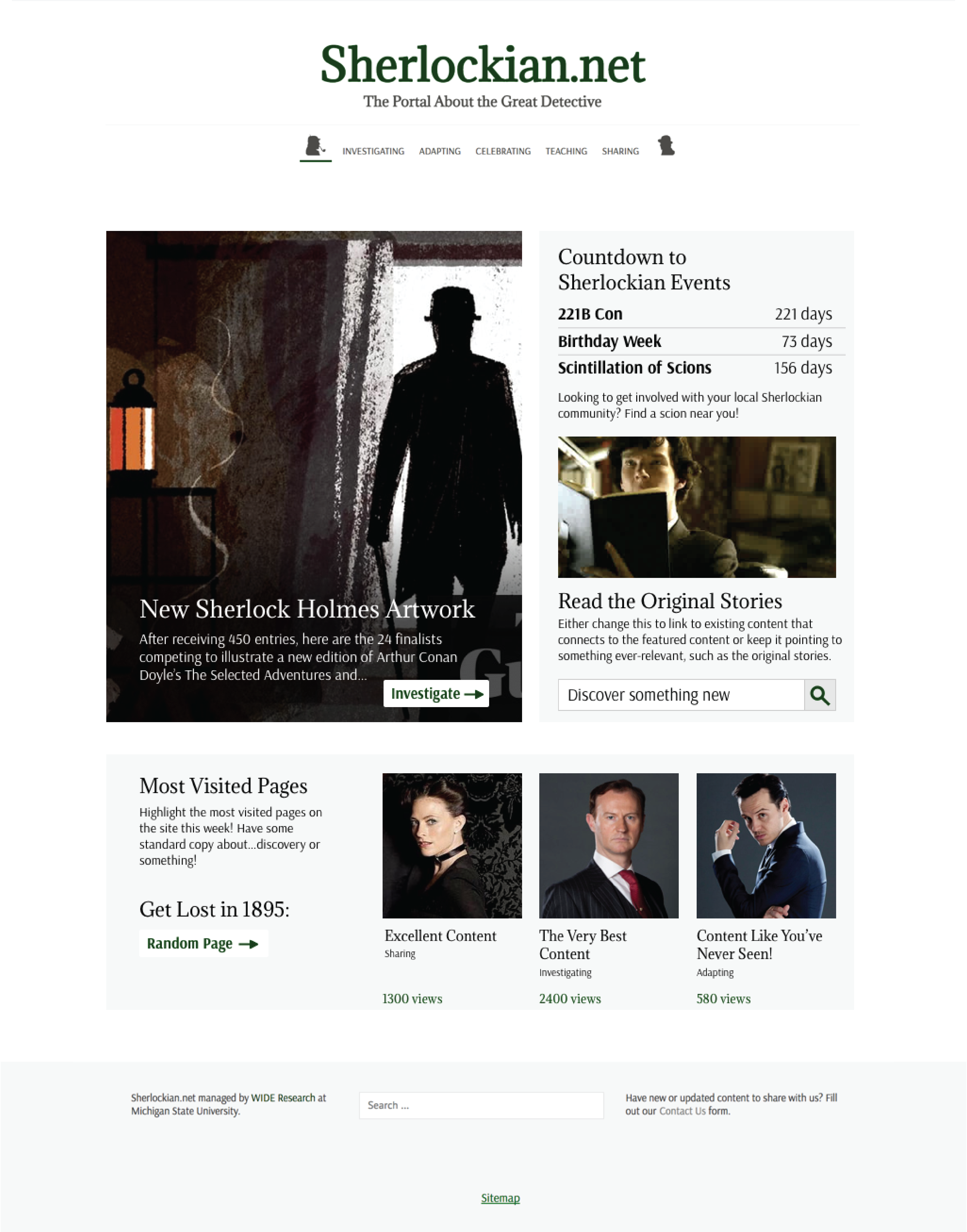
The full mockup of my proposed Sherlockian.net homepage.
After hashing out the design and content of each homepage module, I combined them into a complete mockup to share with the team. We've made a few more tweaks and modifications, but now that we have the green light to bring the design to life, it's moved on the development.
Search Results Page
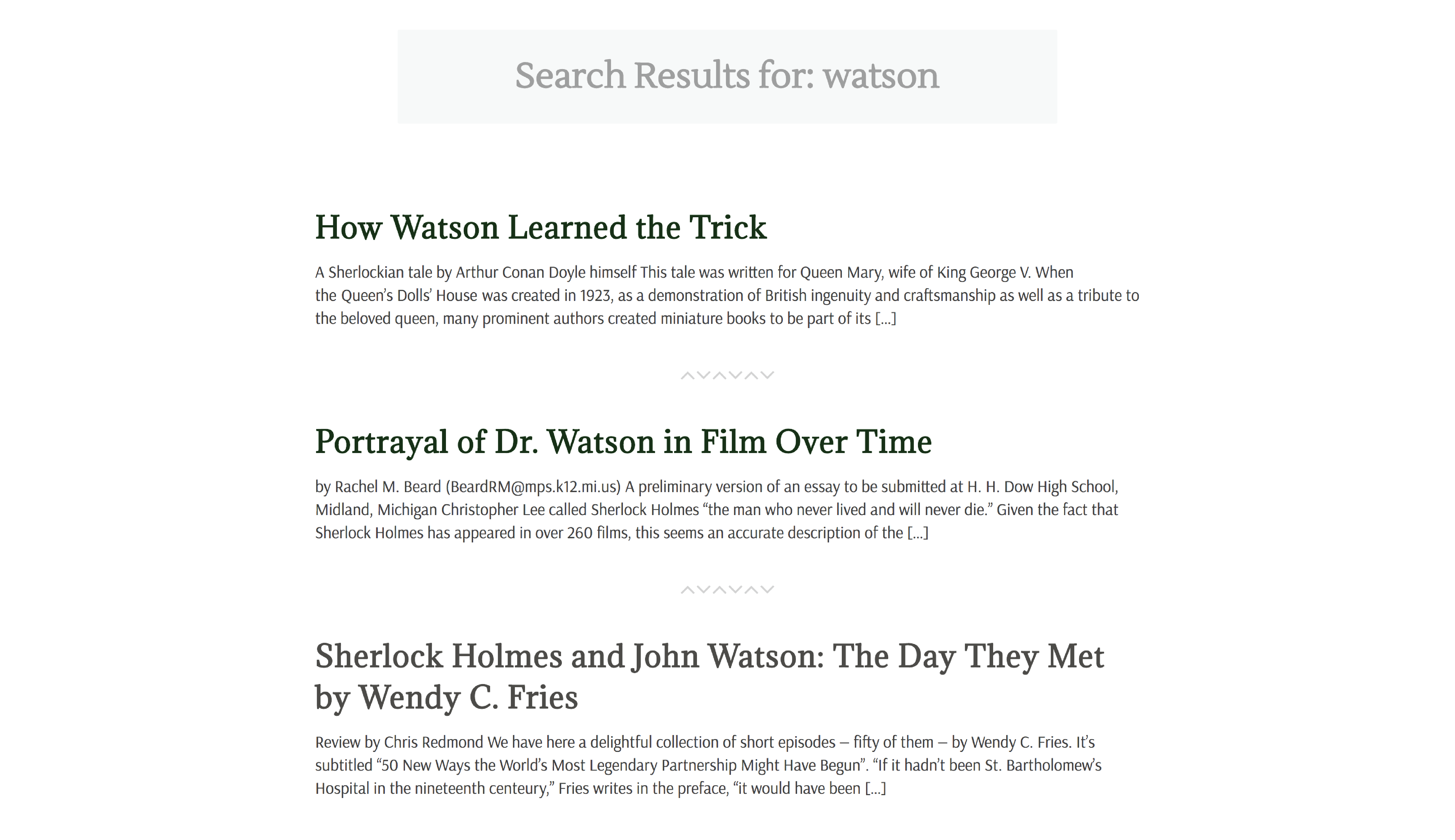
As we searched for other ways to ease users' transitions into the new Sherlockian.net, I identified another pain point. While we'd noticed issues with the location of the search bar in the inital design, we hadn't ever actually tested it. I gave it a shot just to see the design of the results page, and I was shocked to see that the page turned up the full entry of page or post that contained the search term.
I showed this issue to our web developer, and he and I worked together to solve it. He modified the theme PHP file to output only an excerpt of each search result, rather than 100% of the content. From there, I added a CSS class just to the search results page and made changes so the design would align more with what conventional results pages look like. We wanted this crucial function to feel usable and familiar, but also fit into Sherlockian.net's visual identity.
Sherlockian.net search results, left-aligned and showing only excerpts.
Marketing
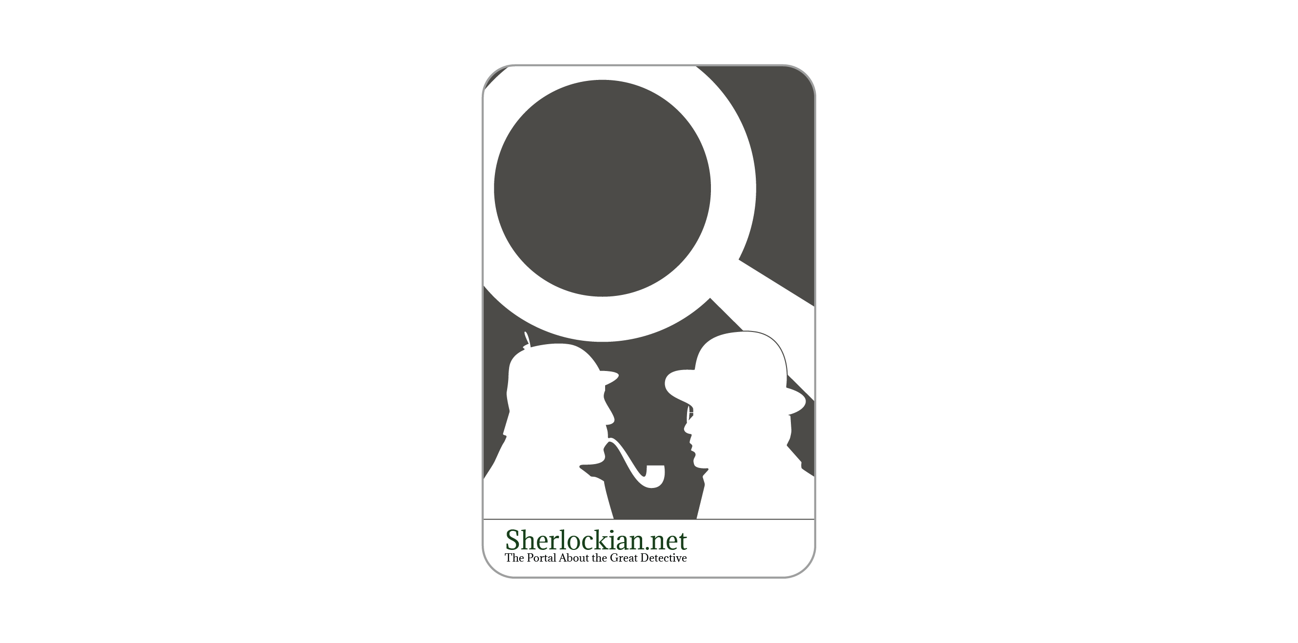
While the Sherlockian.net website was the team's primary focus, along the way I also created materials for us to market the brand new site. Using the visual identity I'd crafted for the site, I designed stickers and business cards that WIDE director Liza Potts handed out as she took the site to various Sherlockian events for user testing and community feedback.
The Sherlockian.net sticker was our first marketing material.
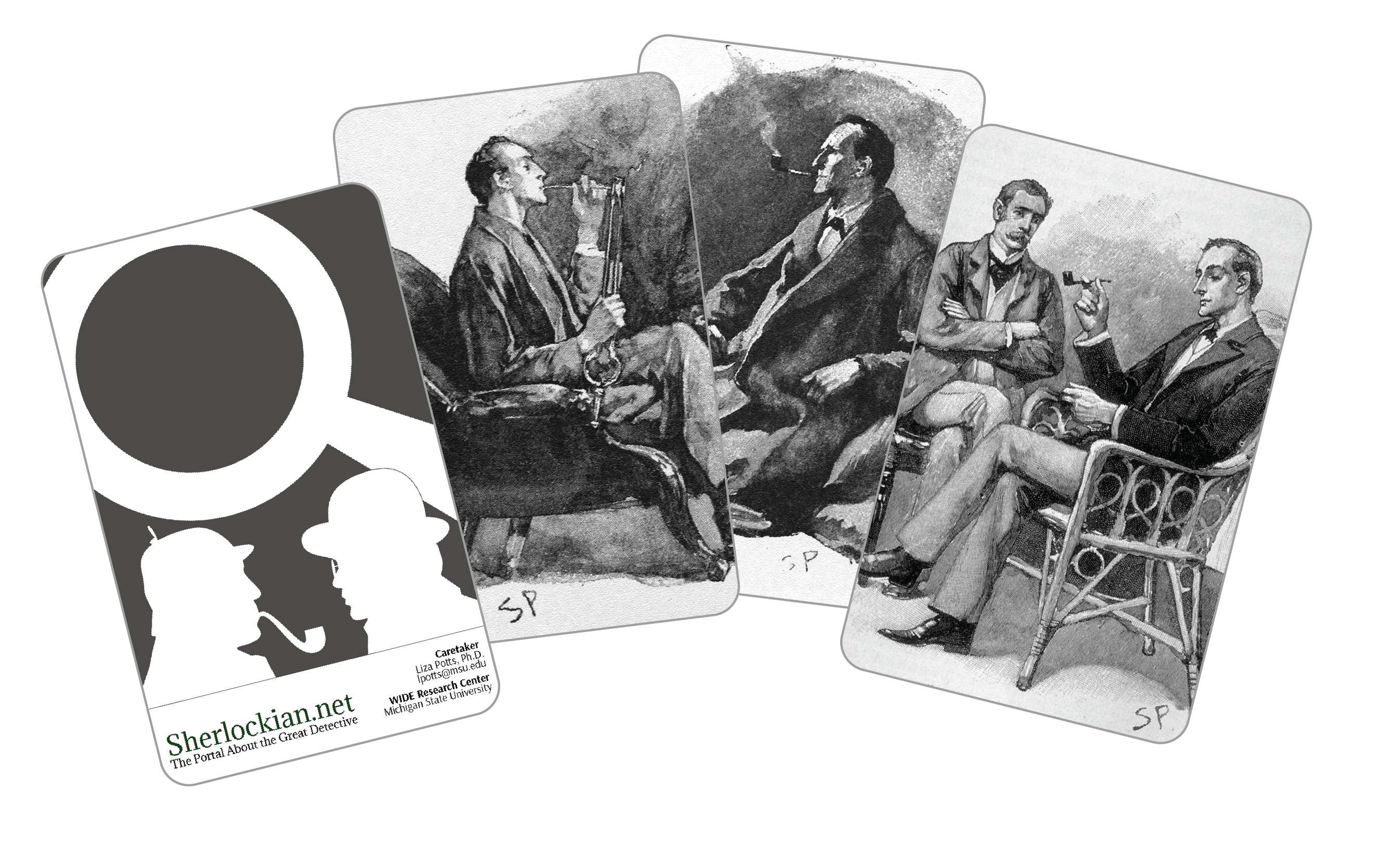
We made sure to be conscious of the community even as we ideated for seemingly straightforward things like the business cards. While the front side is our graphic elements and information, the backsides of the first cards each had one of four drawings by Sidney Paget, the illustrator whose work accompanied the original stories. For the next set, we decided to change the four backs to utilize fan art, effectively creating a piece of collectable memorabilia for fans of Sherlock Holmes and Sherlockian.net.
Our original business card designs featured Sidney Paget's artwork on the backs.
After the site's launch, we began to get more creative ideas for marketing materials the site should have. We first came up with a plan to produce lapel pins for the site.
Artwork for the Sherlockian.net lapel pin.
And as 221B Con approached and announced that for 2018 they would be arranging a ribbon exchange, we knew we needed to have our hand in that game.
Design for the Sherlockian.net conference ribbon at 221B Con.


Get in Touch
Email me! Connect with me on LinkedIn!