Dashboard UX Design / Information Architecture and Interface Design
Project Overview
Challenge: After years of research on Steelcase's use of Enterprise Social Media (ESM) software, Dr. Wietske van Osch asked her contacts if there was anything she could put together in return for the access to data that she'd been granted. They came back with a request for a better dashboard community managers could use to view and analyze trends within the ESM system.
Team: One UX designer, one lead back end programmer and a team of five programmers
My Role: Sketching, wireframing, information architecture, interface design, data visualization, visual design, prototyping, testing, iteration
When I first joined the team, I did a lot of low-fidelity planning to make sure I had a good grasp on Steelcase as an organization and the purpose and goals of the dashboard. From there I moved into mapping out an information architecture and creating high-fidelity mockups for the dashboard. I iterated on each of these stages and eventually crafted an interactive prototype for testing with users at Steelcase. Each of these pieces were also used as resources for the programming team as they built a database and API, then eventually put together the front end of the dashboard.
This process is broken down in detail below, or you can jump to the deliverables to view the final products.
My Process
Coming onto the team of this project, I knew it was going to be a different kind of challenge than those I'd been tackling in other roles and courses. Because I would be designing a dashboard to present data on many facets of user interaction with ESM software, I felt it was important to develop a very good understanding of how the software was being used and how the dashboard was expected to benefit the community manager.
Getting Familiar with the Project
I began by asking a lot of questions about the company's strategic goals, their use of ESM and what data from the ESM software the community manager found most useful. I sent these questions to Dr. van Osch, who either answered them based on her knowledge or spoke to her contacts at Steelcase for more information.
I was given access to the first iteration of the dashboard to form an understanding of the types of data I would be working with and the direction the dashboard might need to go in.
I broke down the different possible pain points and areas for improvement I saw in the initial dashboard.
As I explored the existing interface, I used Jakob Nielson's usability heuristics for interface design to identify usability issues I would want to pay attention to in a fresh design. This helped me shape my thoughts into goals for the new design.
Defining Our Goals
I discussed my ideas with the team. This helped me gain deeper insights about what we might want to do with the dashboard and how it could be useful to the community manager. I also made sure to run each possible feature by our lead developer to ensure that it would be feasible.
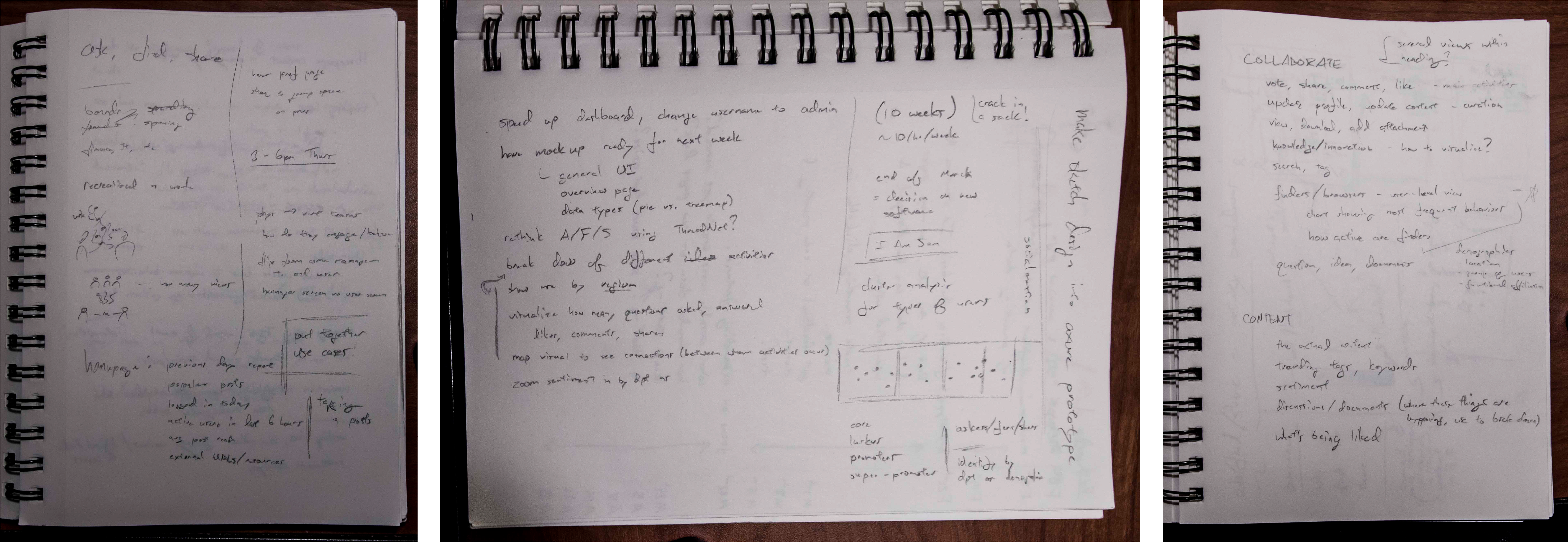
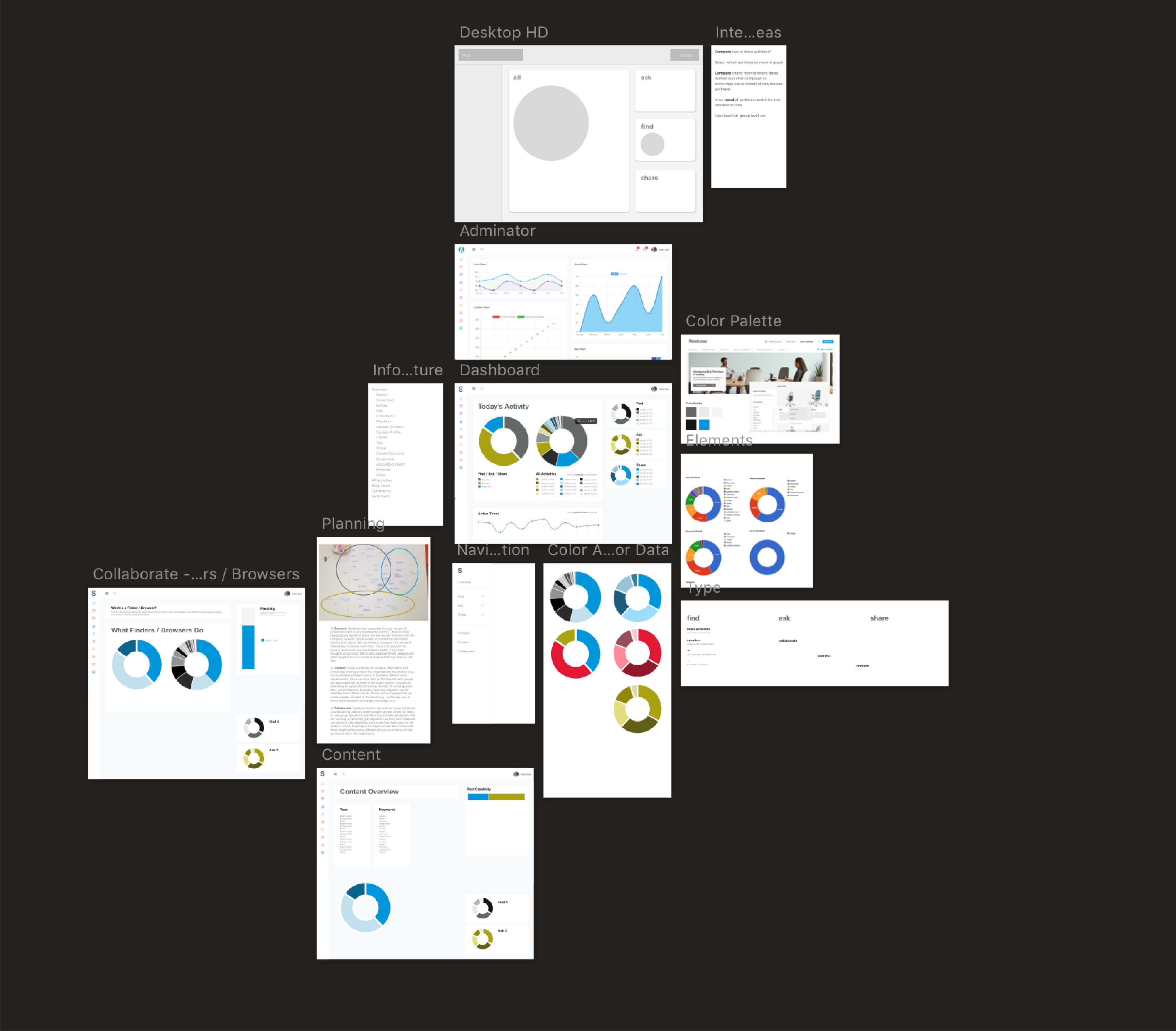
My notes on different concepts, possible information structures and ideas for visualizations.
I took careful notes and made simple sketches during each of our meetings to organize our thoughts and ideas.
Organizing the Information
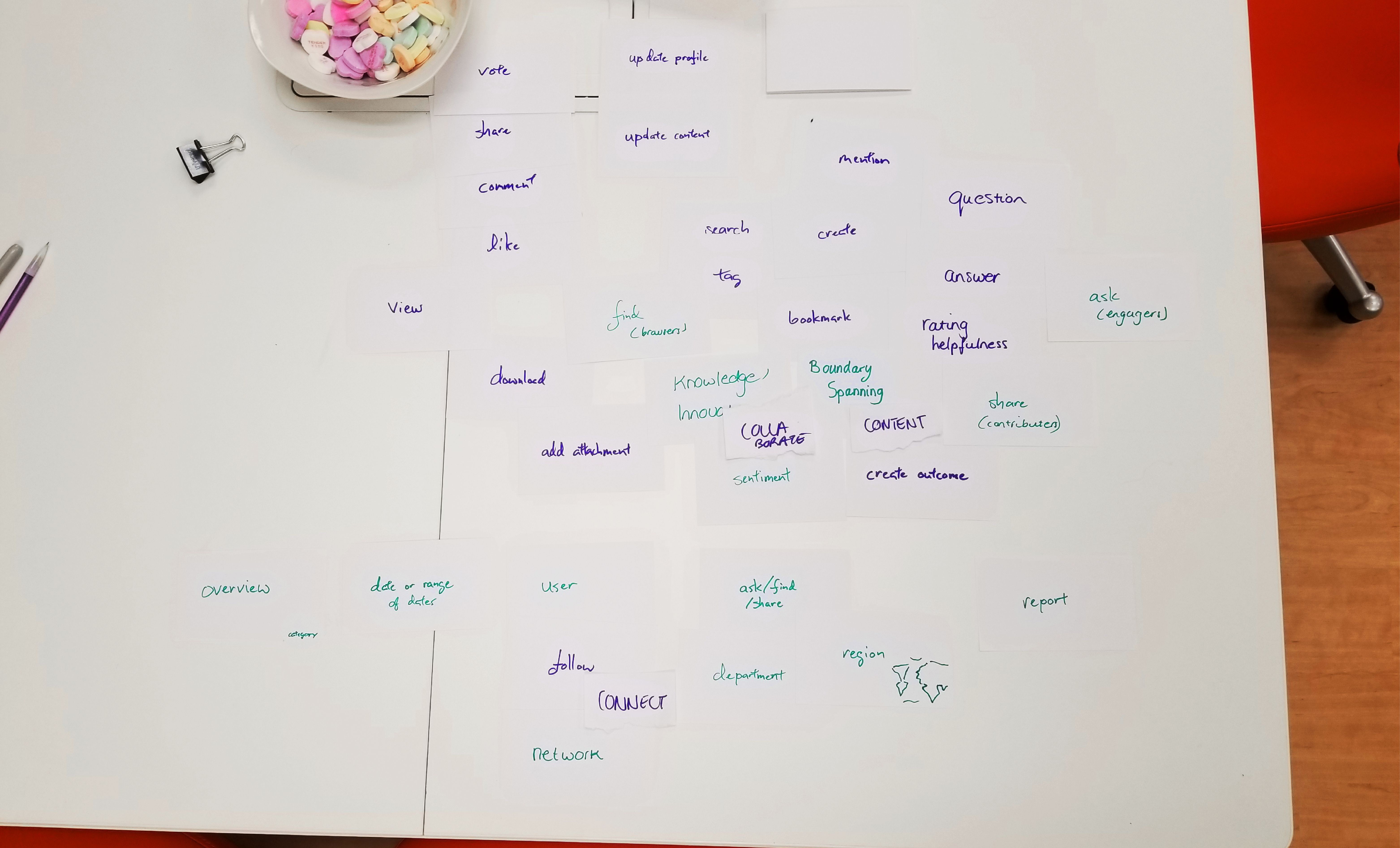
I had learned that the Steelcase community manager sorted activities within categories called Find, Ask or Share, but also that the company had worked with a consulting firm to designate its strategic goals for the ESM software, labeling them Connect, Content and Collaborate. I worked with my team to make an affinity diagram and see how these terms fit with the activities and concepts we were attempting to visualize.
We used affinity diagramming to understand how everything fit together (we only had index cards, but this was an internal process to organize our ideas and how we thought about the project, so I wouldn’t call it a card sort).
We came to a few conclusions about how our dashboard should work:
We knew we wanted a homepage to act as an overview of the most important data, and decided here that it should present the main Ask/Find/Share information and offer options for filtering.
Because the Ask/Find/Share pages felt like they should be straightforward presentations of the activities they encompassed, we realized that trying to fit concepts like boundary spanning or sentiment into them wouldn’t work.
We came up with a plan to also have a set of Connect/Content/Collaborate screens, focused on deeper measurements of how users were interacting in the ESM.
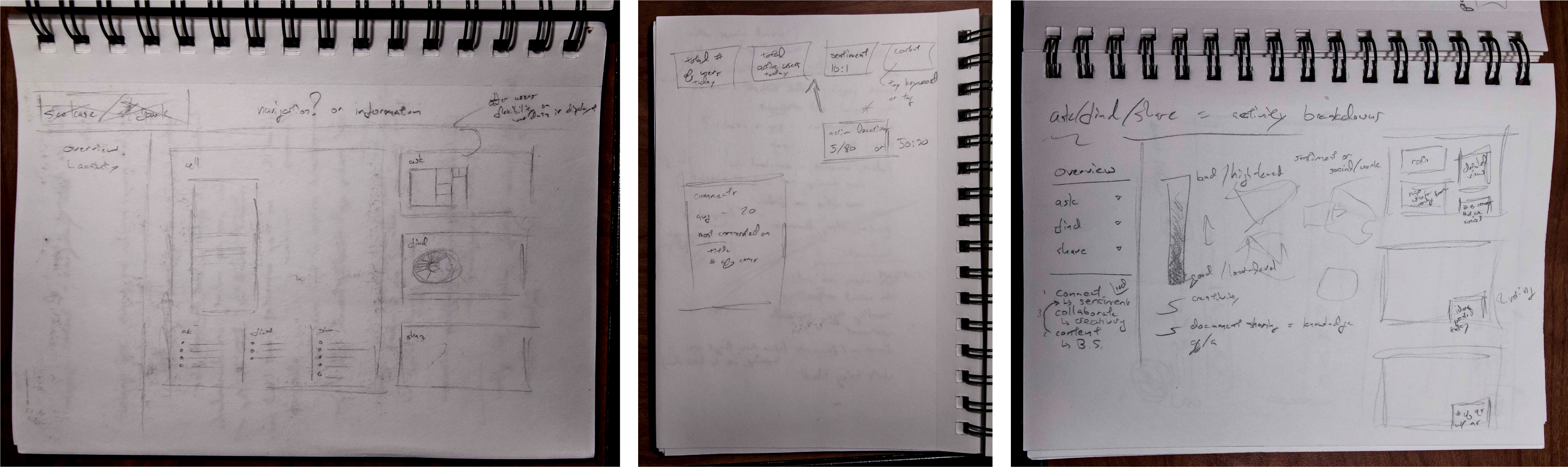
Armed with a plan for how to organize the information, I started sketching out the different screens we’d thought of.
I sketched out overall plans for the overview and different sections (Ask/Find/Share, Connect/Content/Collaborate), as well as planning out smaller modules like the set of quick stats that would sit at the top of the overview.
Once I’d put together general concepts for the main modules on each page and reviewed the plans with my team, I moved on to crafting higher fidelity designs.
Stitching Everything Together
The first page of a Sketch document for me isn't about beautiful screen design: it’s a place to gather ideas, make plans for colors and type styles, and just begin to test out how screens should look. It’s a way to transition from low-fidelity work into more detailed design.
The organic first page of my Sketch document, used to test out ideas and create initial graphics.
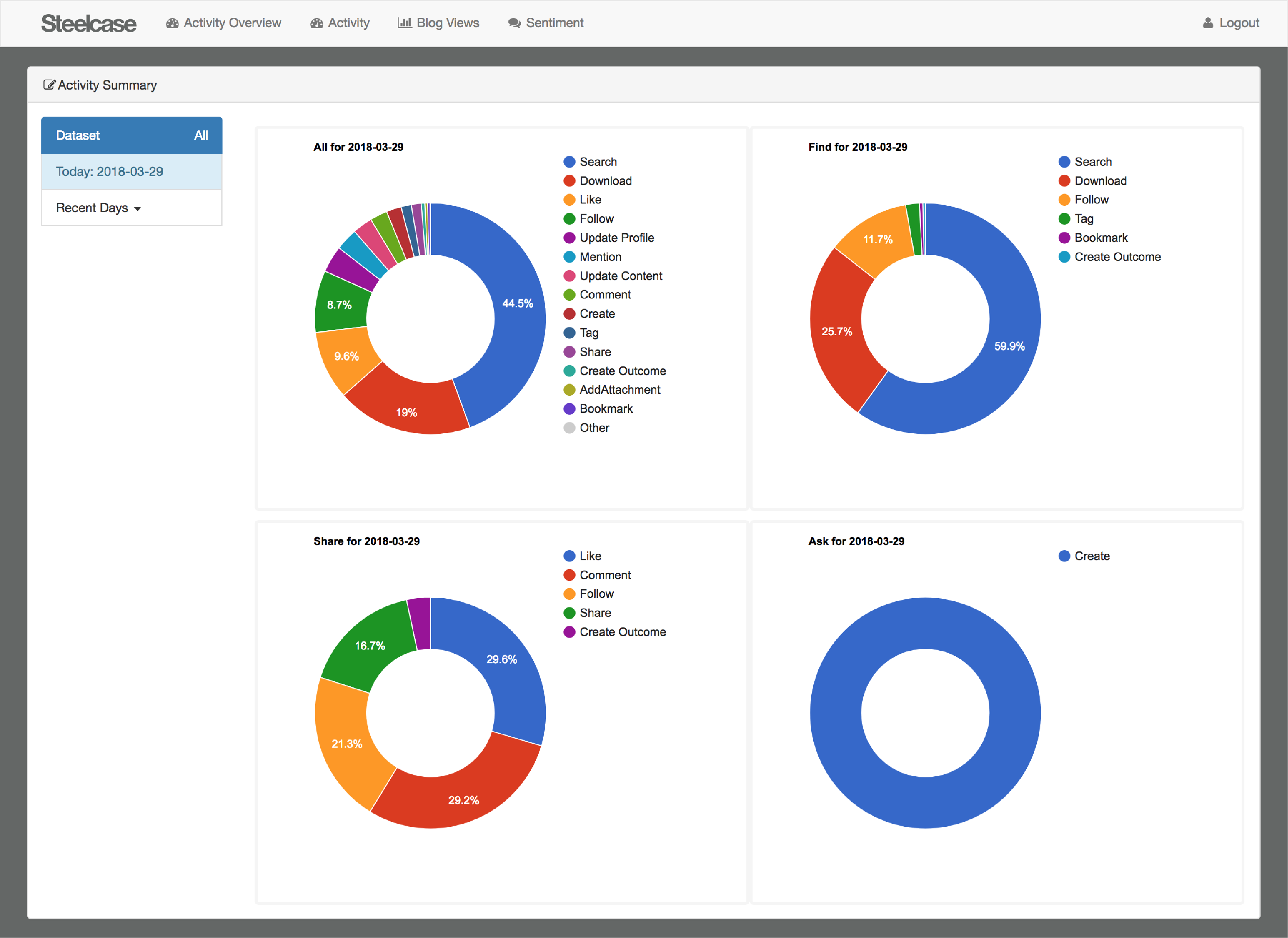
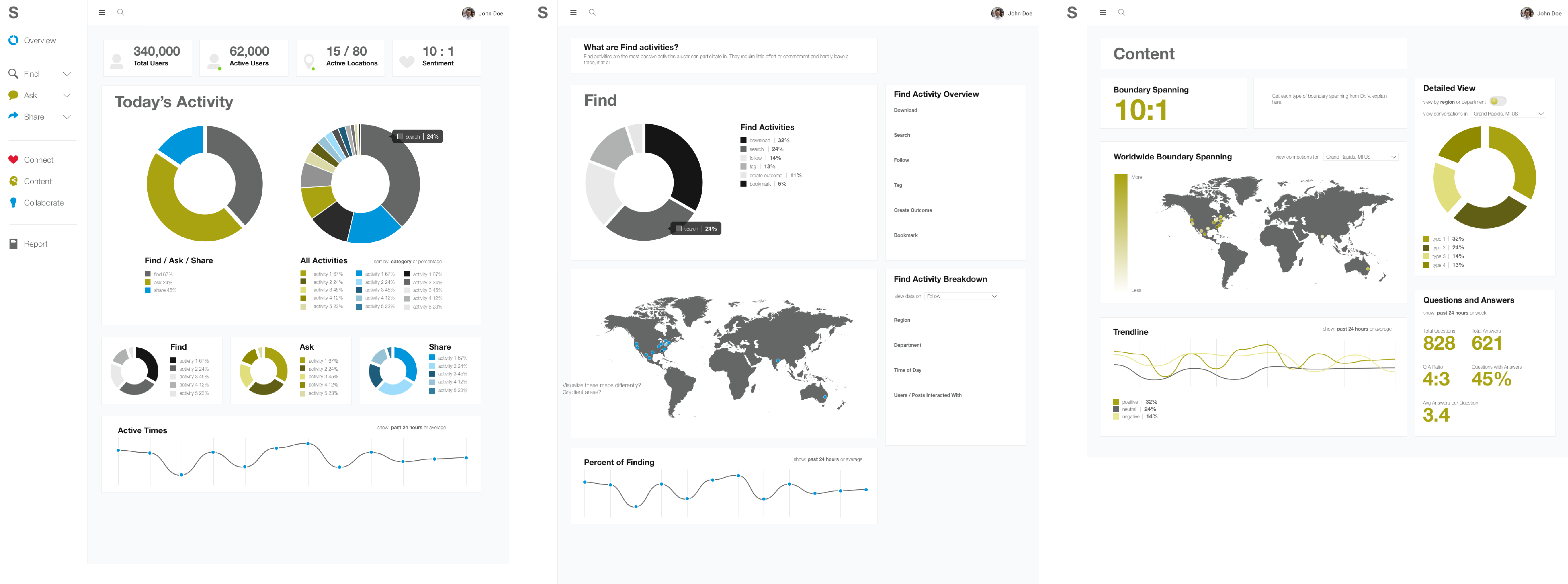
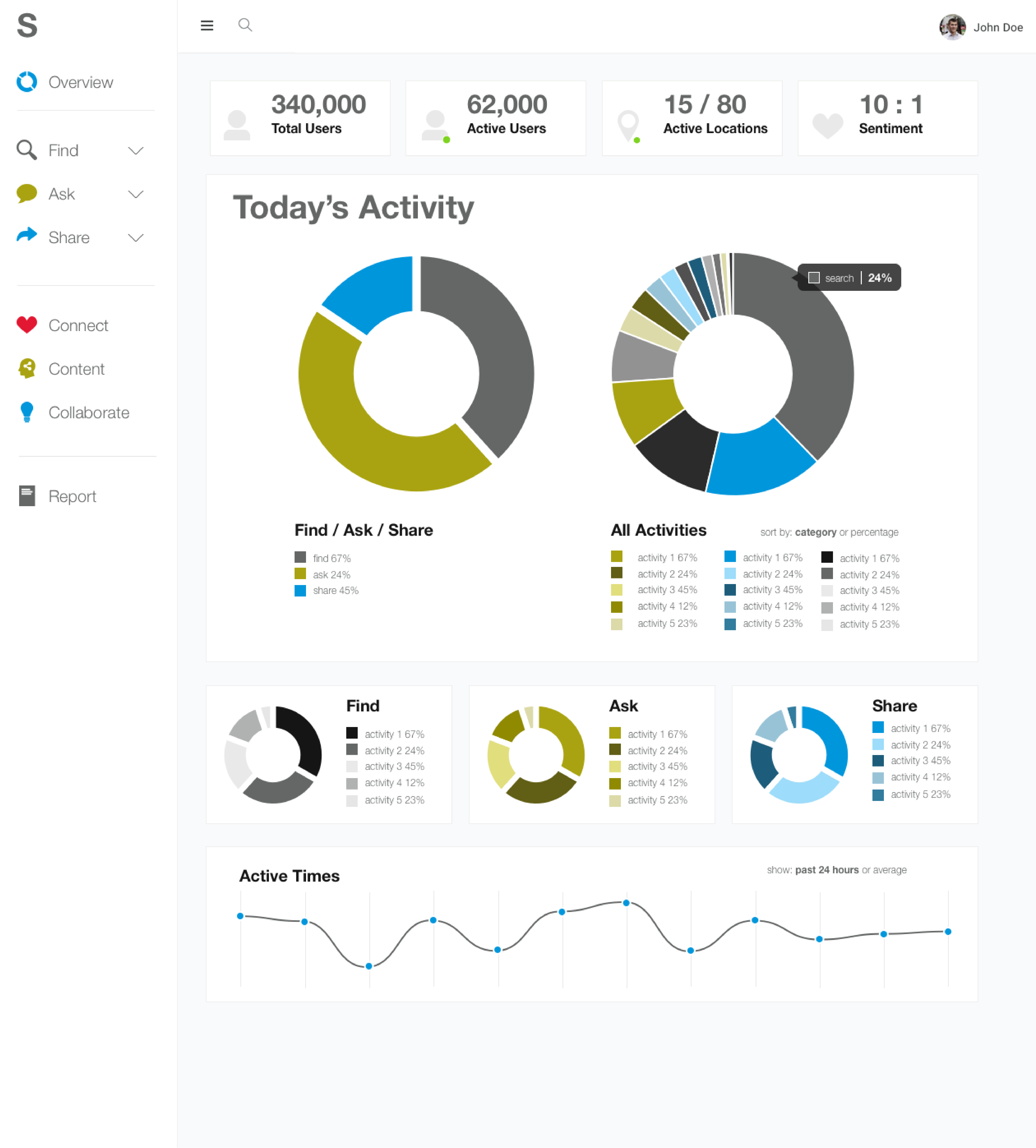
With a color scheme planned out and decisions made on the visualizations would be presented, I created the high-fidelity designs for each screen.
The Overview, Find and Content page designs.
As each of these designs was updated and eventually completed, I added them to a simple Axure prototype that the dev team could access to see how the data should be presented and what interactions needed to exist on each page.
This project is currently in its major development stage, and I’m working now to fine tune the filtering and sorting for each screen and to test what currently exists to see how well it works for users and if there is a need for any additional features.
Lessons Learned
It is crucial to communicate with your developers. There were often times where I had ideas for different content that could be useful to the dashboard’s users, only to run it by the developer and learn that the idea was based on information that isn’t currently available in our database. I saved a lot of time by not fleshing out ideas only to find they weren’t feasible.
Don’t be afraid to ask questions. When I first joined the team, it was a little overwhelming to figure out how everything fit together and what the concepts we wanted to visualize were. I spent a lot of time in the beginning just having conversations, taking notes and beginning to sketch out ideas (some that worked, some that didn’t).
Your process doesn’t have to totally fit the mold. While I felt like I was doing what I was supposed to by sketching and affinity diagramming, when I first began designing digitally and created that collection of artboards full of ideas, I worried I might be doing something wrong. I’d never seen that type of ideation represented in the Instagram posts or case studies of my favorite designers, but I realized eventually that if it was working for me, I didn’t need to question whether or not it was something others did.
Deliverables
This project was an in-depth dive into the UX design and information architecture of the community management dashboard. My only primary deliverable was the final design for the dashboard.
Get in Touch
Email me! Connect with me on LinkedIn!