Web and Print Design / Photography and Marketing Material Design
Project Overview
Challenge: I joined the team of Teta, a short documentary detailing Alexandra Hidalgo‘s journey nursing her youngest son, just as production was nearing an end. As it moved into post-production and submission to film festivals, Teta needed several materials designed to market it.
Team: Ten crew members in total, two of them designers
My Role: Photography, poster design, website design, photo editing, press kit design, dvd case design, social media postcard design
I began by working concurrently on a visual identity for the website and poster. I also designed the film's press kit and DVD case and disc. As the film progressed into the festival circuit, I created a set of social media postcards to keep Teta's followers informed of the film's success.
Website
To design the film website, I had the opportunity to work with stills and create graphic elements that would be repeated across the site, press kit, and other materials. I collaborated with Alex to choose colors and fonts consistent with the message of the film and worked within WordPress to make the site a reality.
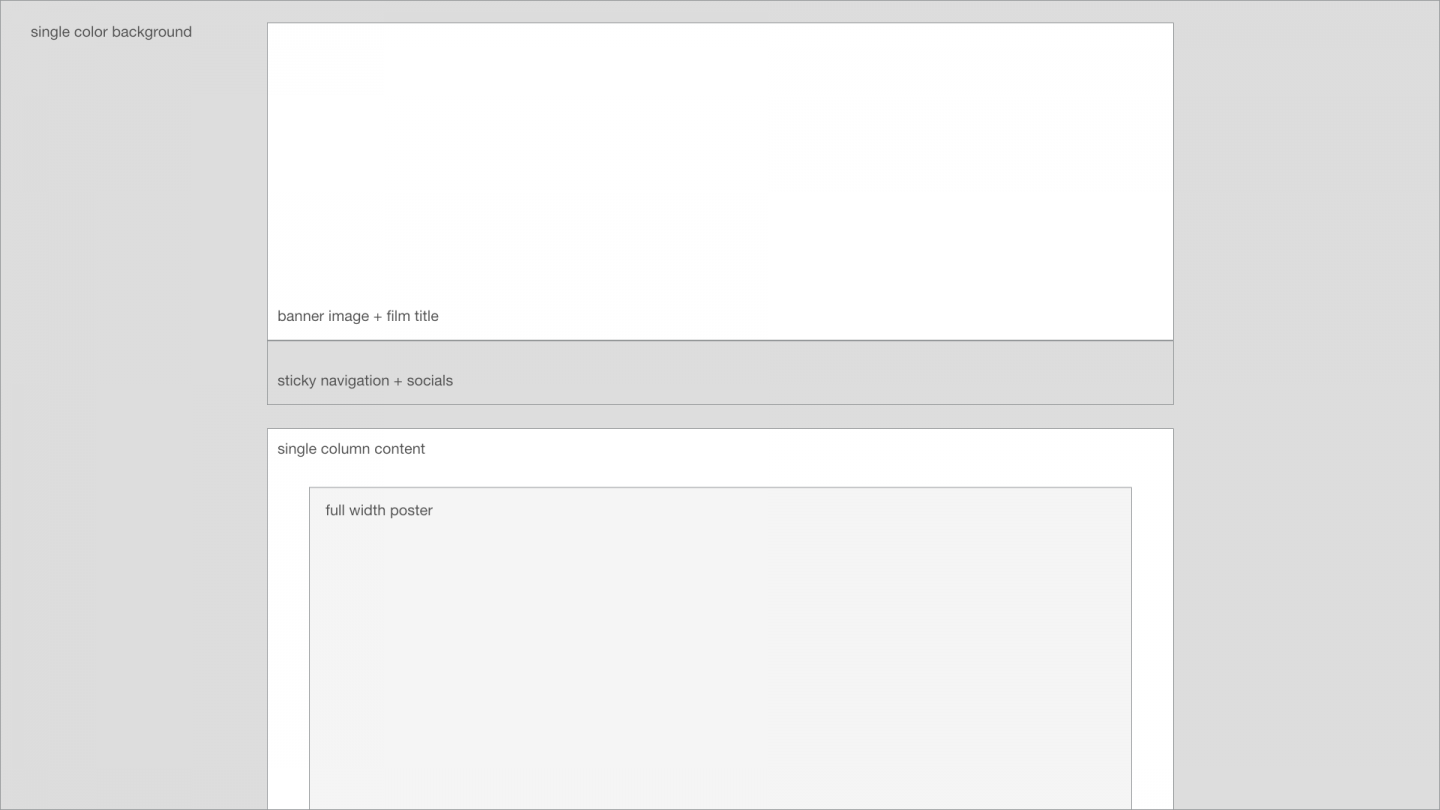
I began the process by developing a simple outline for how the site should look. Once I had a basic idea of what we wanted out of the site, I created a wireframe.
Initial wireframe for the website.
After that, we set in on hashing out the design details of the site. Because my employer had websites made for previous films, she knew what she wanted the information architecture to look like. Color schemes, fonts, and visual elements were my job.
I scoured through the stills, behind-the-scenes images and principal photography we'd decided to use, identifying the colors that appeared to pop up most frequently and represent the feel of the film. I picked out a warm brown and a blue for our main colors, and a green that we could also utilize for certain materials. From there, I added shades and tints of each color that we could rely on.
We developed a color scheme with shades and tints of our main brown, blue and green.
Since making these decisions about color, I've learned and studied more about visual and user interface design. I've read advice that urges designers to use one color with a variety of shades and tints, and keep one accent for very sparing use. I've gone back and forth about whether I think I made the right choices here, given that Teta is an independent documentary and its visual style needs to be intentionally divergent from the mainstream anyway. For now, I've settled on the opinion that whether or not I would make the same choices now, I had the opportunity to learn a lot by making them then and reflecting on those decisions in present and future work.
Selecting fonts for Teta's visual identity was a fun process. Because the film tells the story of nursing a baby rather than expliciting delving into the politics of it, I decided it was okay to use something lighthearted that would capture the essence of the tale.
I landed on Francois One for headings and Lato for the body text. Both are available as Google Fonts and would be easy to integrate both into the website and the print materials.
Using this visual identity, I began to craft the pieces of our website.
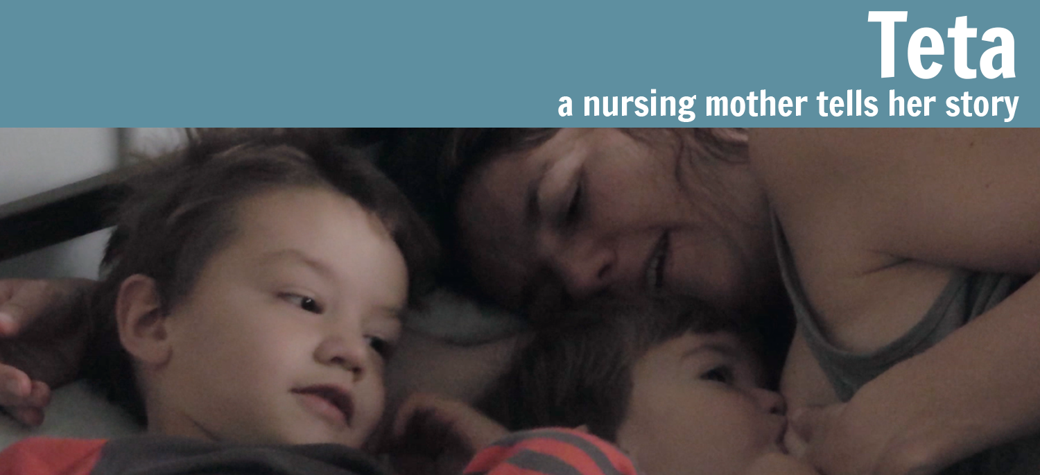
Our banner image was composed using a still from the film and a shade of blue from our color scheme.
As the pages of Teta's website began to fill with content, my employer and I each expressed that the pages were lacking something. We wanted more of the personality of the film to shine through, and we also wanted to make more use of the stills that we had. Everything is visual, but a movie is especially so.
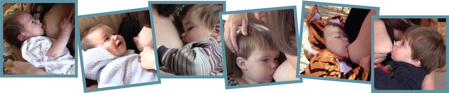
We decided to put together a footer that could be included on each page of the site. It shows Santiago, Alex's son, at six points in his nursing journey. He starts as a newborn and ages from left-to-right until the last photo, which is from his last nursing session. We made these decisions because we wanted the visual element to embody how the film chooses to tell a story in sequence rather than jumping around chronologically.
The footer on each page is a collection of stills from the film that show Santiago nursing as a newborn up until he is almost done.
Poster
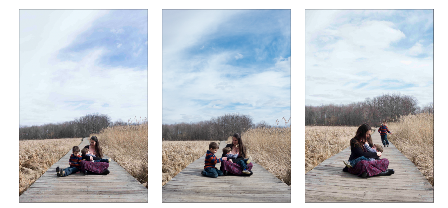
On a brisk March day I shot the principal photography to use for the poster design. We had a plan, so we headed to a location that fit the idea for the poster.
We narrowed down the photos to the three that best represented the film, then worked from there.
After I reviewed and edited the photographs in Photoshop Camera Raw, we chose our top three to work with. From here, I worked together with my employer to consider a tagline and a set of fonts to use within the design and tested them out in InDesign.
Selecting the fonts and whether or not to use a tagline was an important part of crafting the film's image.
Once these details were settled on, I pulled the headline section into Illustrator and saved it as an asset in CC Libraries. I knew we would need posters at different dimensions and other future content that I could design more efficiently without having to resize and reorganize the headline every time. I did the same for other pieces of graphic content, such as the production company logo and the credit block. With everything in place for the next steps, the final poster could now be composed.
The final poster.
Press Kit
Every film needs a press kit, and I wanted Teta's to utilize the same visual style I'd created for the website and marketing. Alex provided me with the content as a Word document, and I set to work laying it out in InDesign using the fonts, colors and graphic elements we'd been using.
Different elements from the website and marketing materials were utilized across pages of the press kit.
I also had the opportunity to design the DVD case and disc artwork for the film's distribution. This was a different challenge than my previous pieces because of the template that needed to be adhered to.
The front of the case and disc are reminiscent of the poster design, while the back was a chance to play with pairing images and text in a unique way.
Social Media
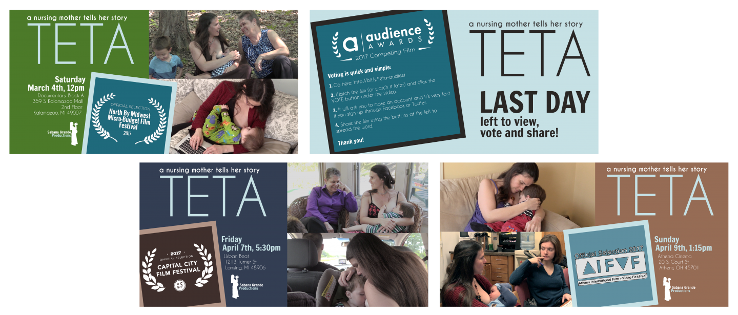
As Teta made its way through the festival circuit, we realized we wanted to share each time the film was selected to be shown or when it received awards. We also wanted to promote the screenings so social media followers of Alex's production company, Sabana Grande Productions, could see if an opportunity arose near them to see the film.
Initially I thought it would be possible to make each social media postcard as the occasion arose, but Teta was blazing through festivals and winning numerous awards. I instead designed several templates for postcards that could be modified and reused by Sabana Grande's social media manager.
Templates for social media announcements in a variety of circumstances.

Get in Touch
Email me! Connect with me on LinkedIn!